
Clichy
Shanghai
Bordeaux
Singapore
Ajaccio





In the global context of increasing awareness of social, climatic and environmental issues, companies have a key role to play in terms of sustainable development
New consumer trends have emerged and are taking hold: recycled, refillable, bio-sourced, reusable or recyclable packaging, bulk offers, solid cosmetics, formulas without preservatives or additives …
We wanted to formalize and strengthen our CSR approach applied to our internal agency operations with our employees and with our customers in order to meet the challenges of responsible packaging and the circular economy.
To address this challenge, we have set up a CSR committee which unfold the action plan on the following items :
- Social
- to strengthen a safe working environment and develop the talents of our employees
- Business
- in order to assert ourselves as a player in responsible packaging and support our customers in their ecological transition process
- Environmental
- to reduce Bronson’s ecological impact
- Local
- to assert our local roots in Clichy
Projects
Great clients make great projects !
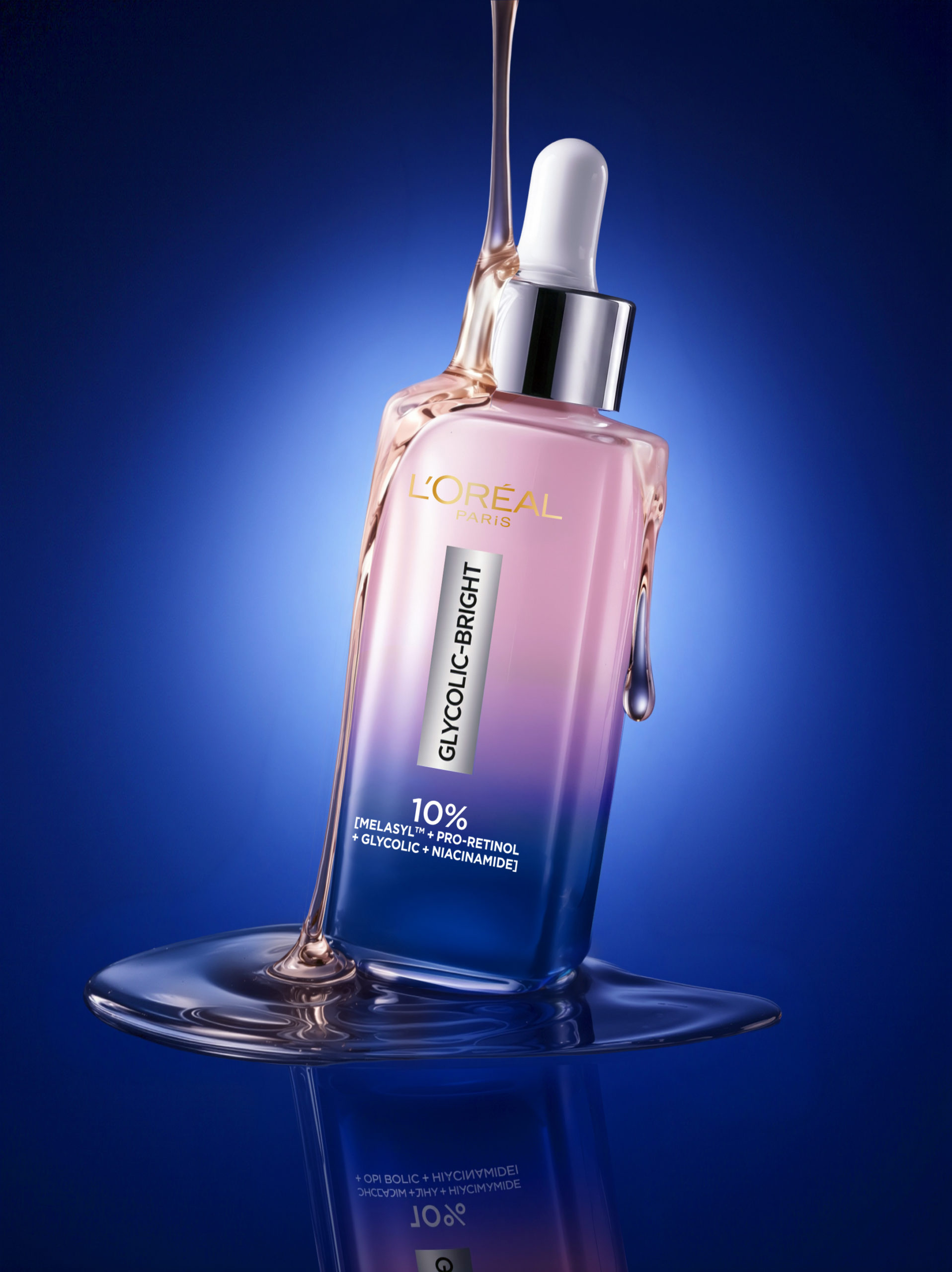
Glycolic Bright - Moon Serum
Glycolic Bright - Moon Serum
GLYCOLIC BRIGHT – MOON SERUM
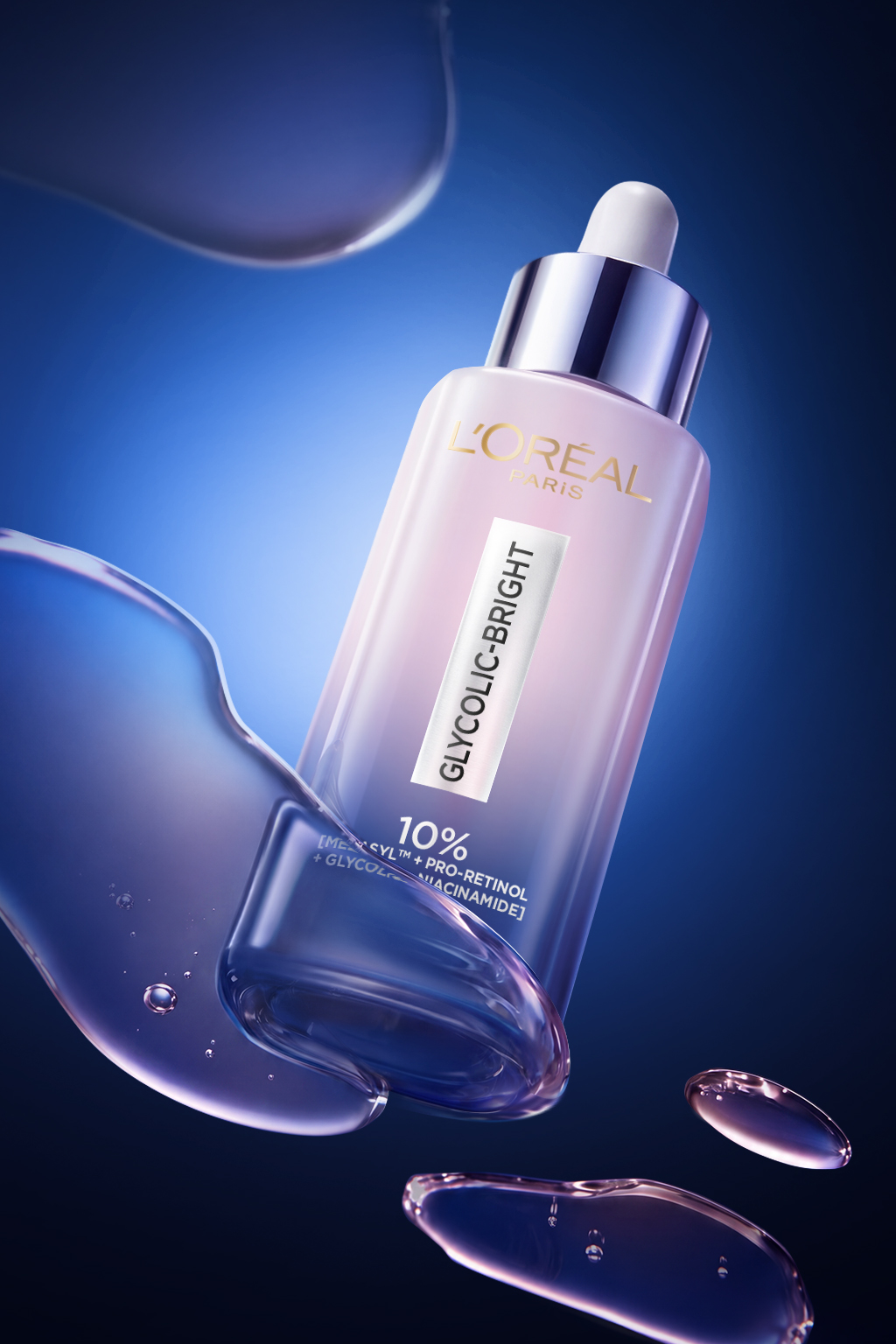
Bronson designed the new Moon Serum, a night treatment inspired by the regenerative power of moonlight.
Following the brightening day serum, we created a packaging that reflects a calm and nocturnal atmosphere through a deep gradient of soft pink and dark blue.
A metallic cap contrasts with the iconic base, revealing the serum’s deep raspberry transparent texture.
More than just a bottle, the design embodies the nighttime skincare ritual, capturing the skin’s quiet transformation while you sleep.
A sensory, elegant aesthetic where every detail evokes renewal and repair.
Visuals – @bronson_group
Belvedere - F1
Belvedere - F1
BELVEDERE – F1
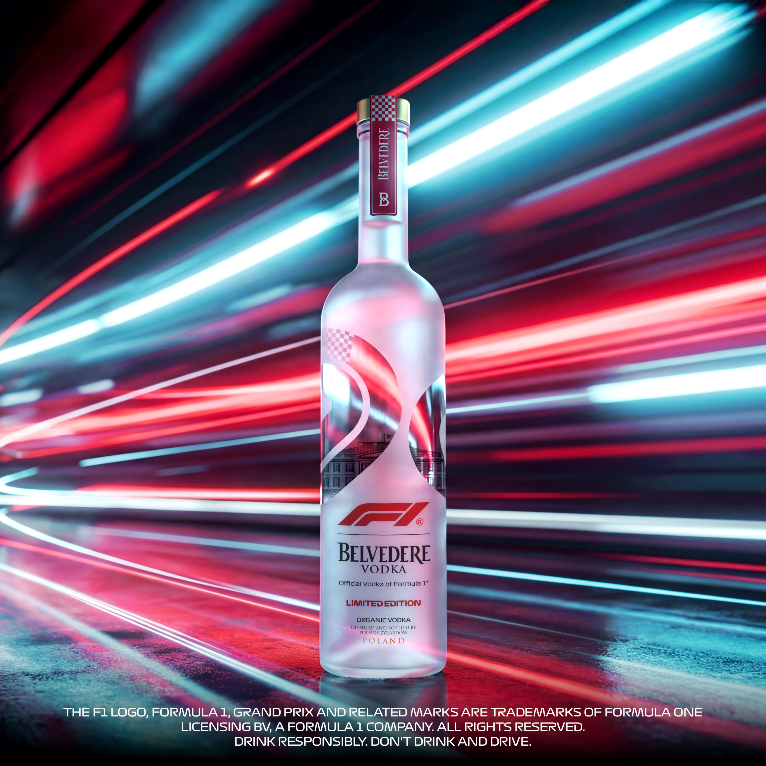
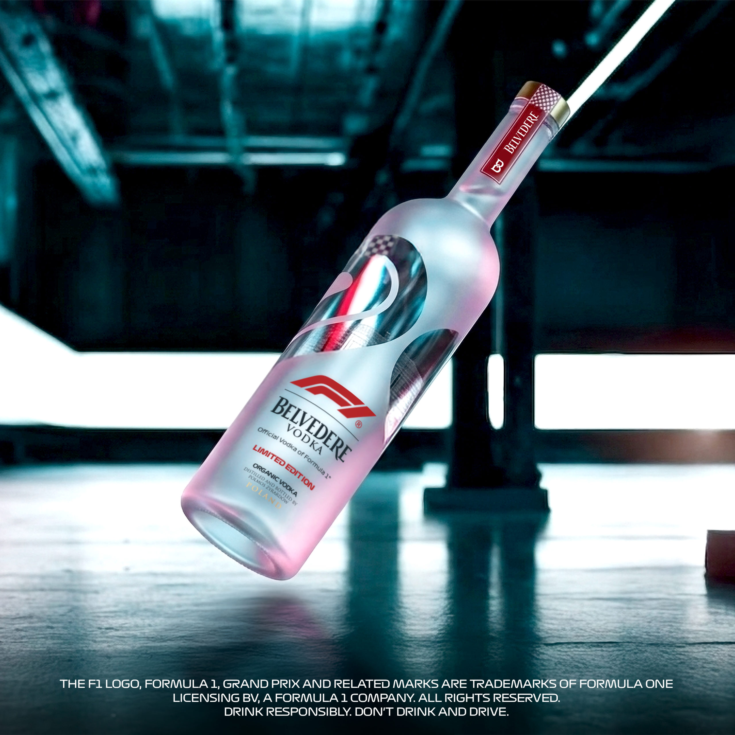
Bronson teams up with Belvedere yet again to unveil the Formula 1® Limited Edition, a design where precision meets spectacle.
Inspired by the world of Formula 1, the bottle balances clarity, speed and tension through a refined visual language.
A racing circuit wraps around the bottle, guiding the eye like a track line. The frosted base contrasts with a crystal-clear window, whose curves echo the geometry of F1 circuits, creating rhythm, depth and movement.
In the background, the Belvedere palace subtly emerges, anchoring the design in the brand’s heritage.
Chequered flag details and flashes of the iconic F1 logo red punctuate the composition, a final nod to the moment every race builds toward: the finish line.
ENJOY RESPONSIBLY, DO NOT DRINK AND DRIVE.
Visuals – @bronson_group
Revitalift - Glass Skin
Revitalift - Glass Skin
REVITALIFT – GLASS SKIN
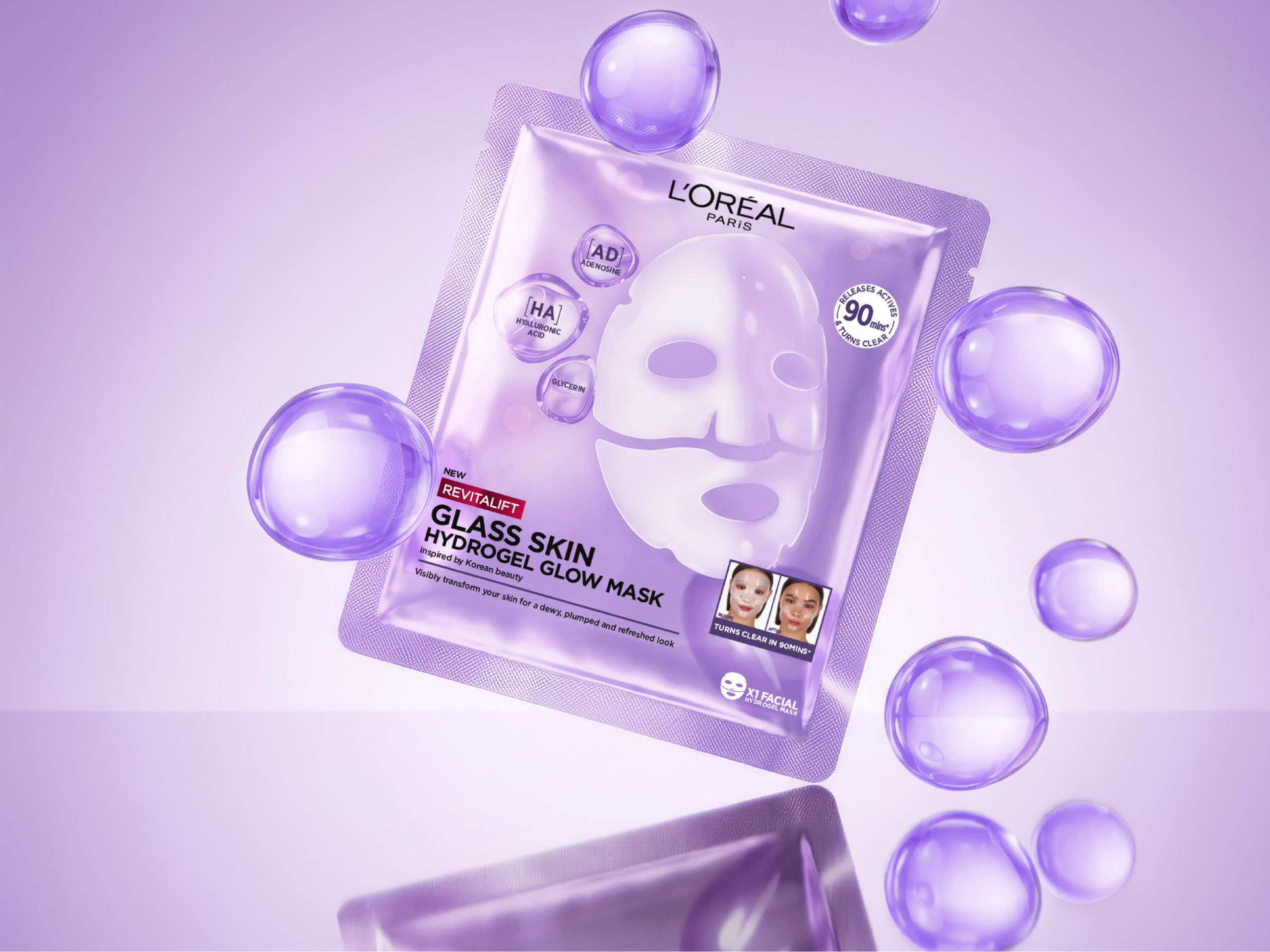
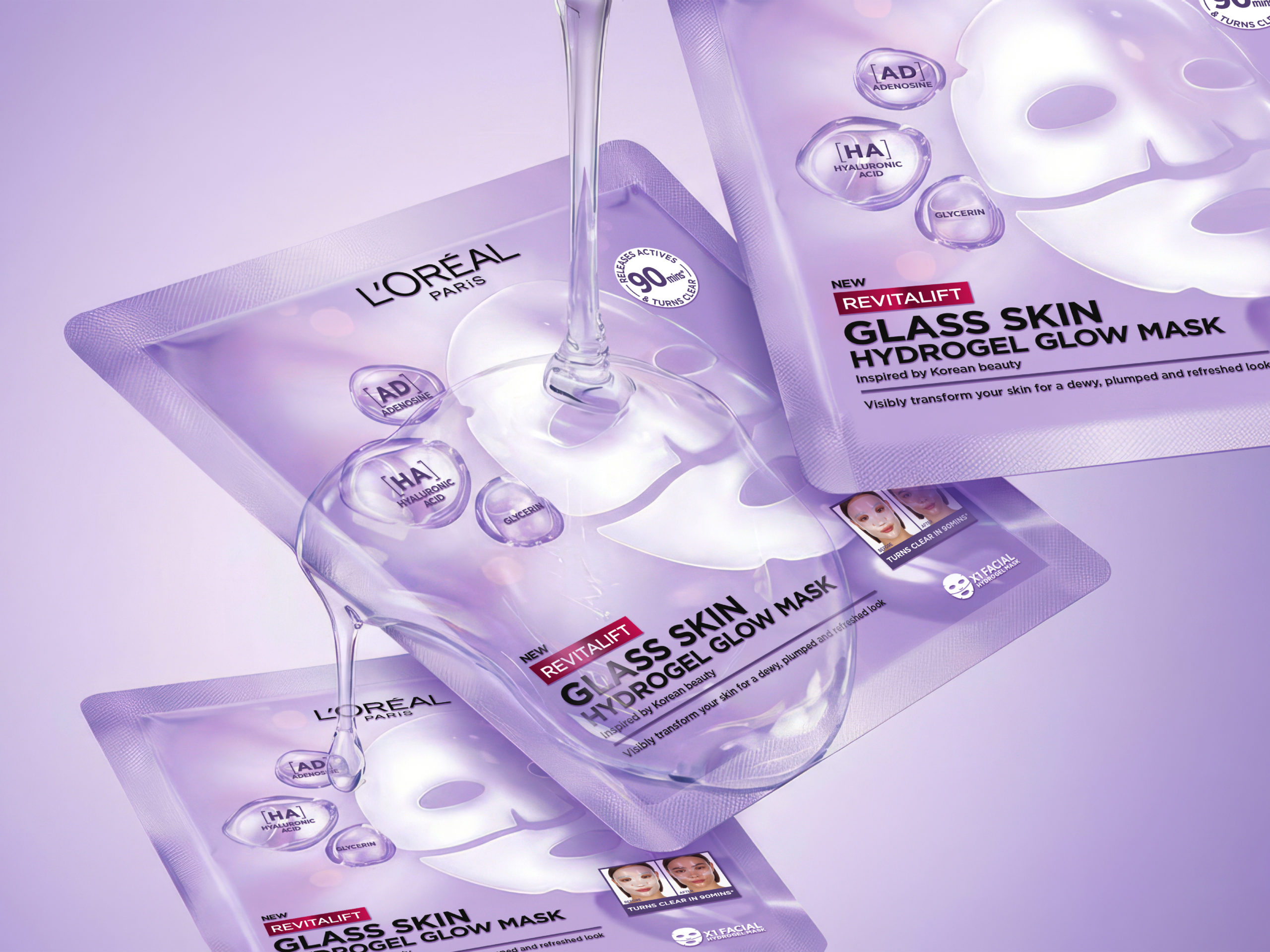
Bronson designed the new Revitalift Filler Glass Skin Hydrogel Mask for L’Oréal Paris, inspired by the glass skin trend.
A luminous lilac monochrome palette, a soft and diffused glow effect, and translucent bubbles create a graphic language that conveys hydration, technology, and performance at first glance.
At the heart of the packaging, the pearlescent hydrogel mask stands out as the icon of the promised result: radiant, glowing skin.
A project where design, clarity, and desirability come together to create immediate impact on shelf.
Visuals – @bronsongroup
Rivadouce
Rivadouce
RIVADOUCE
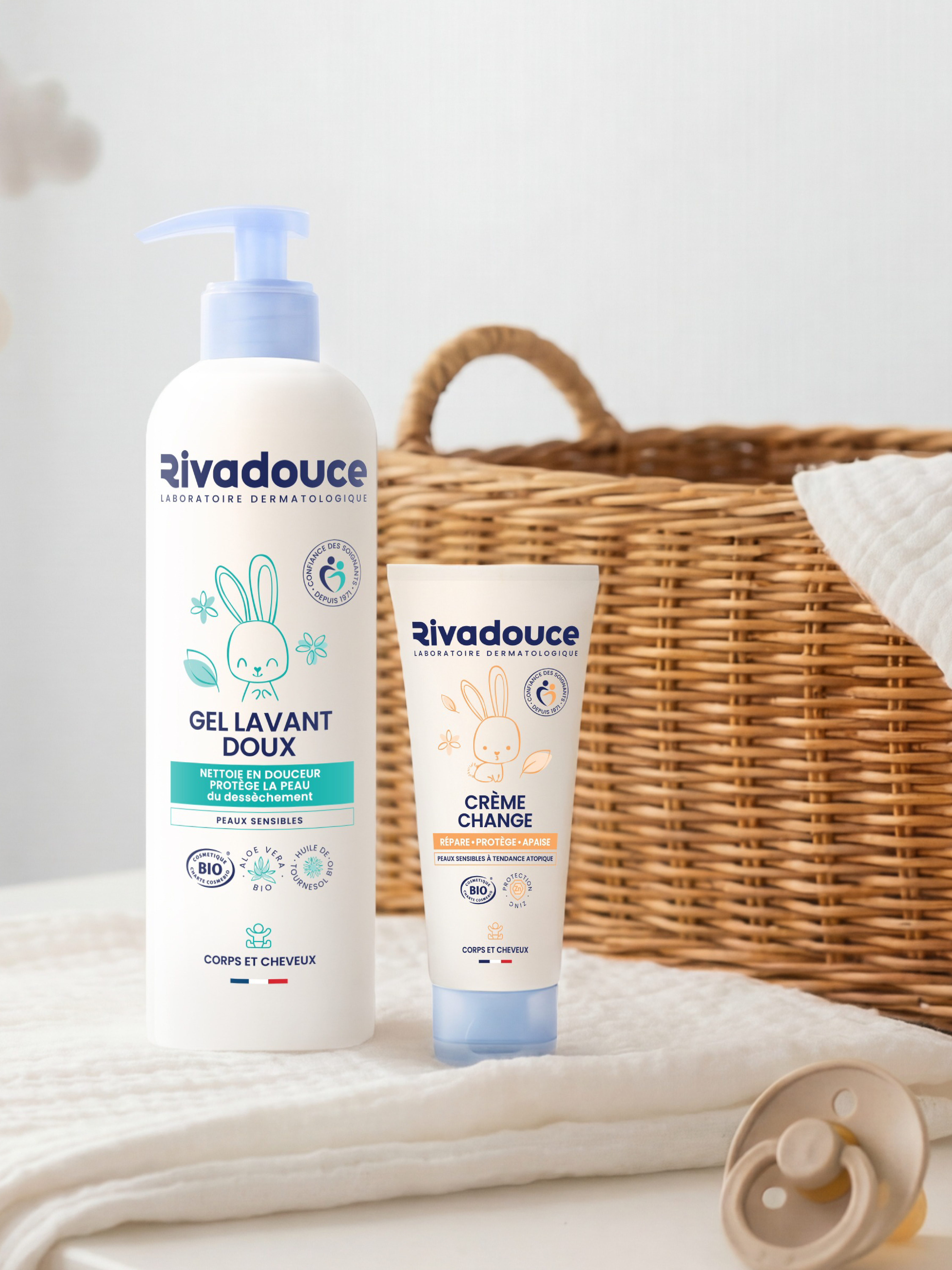
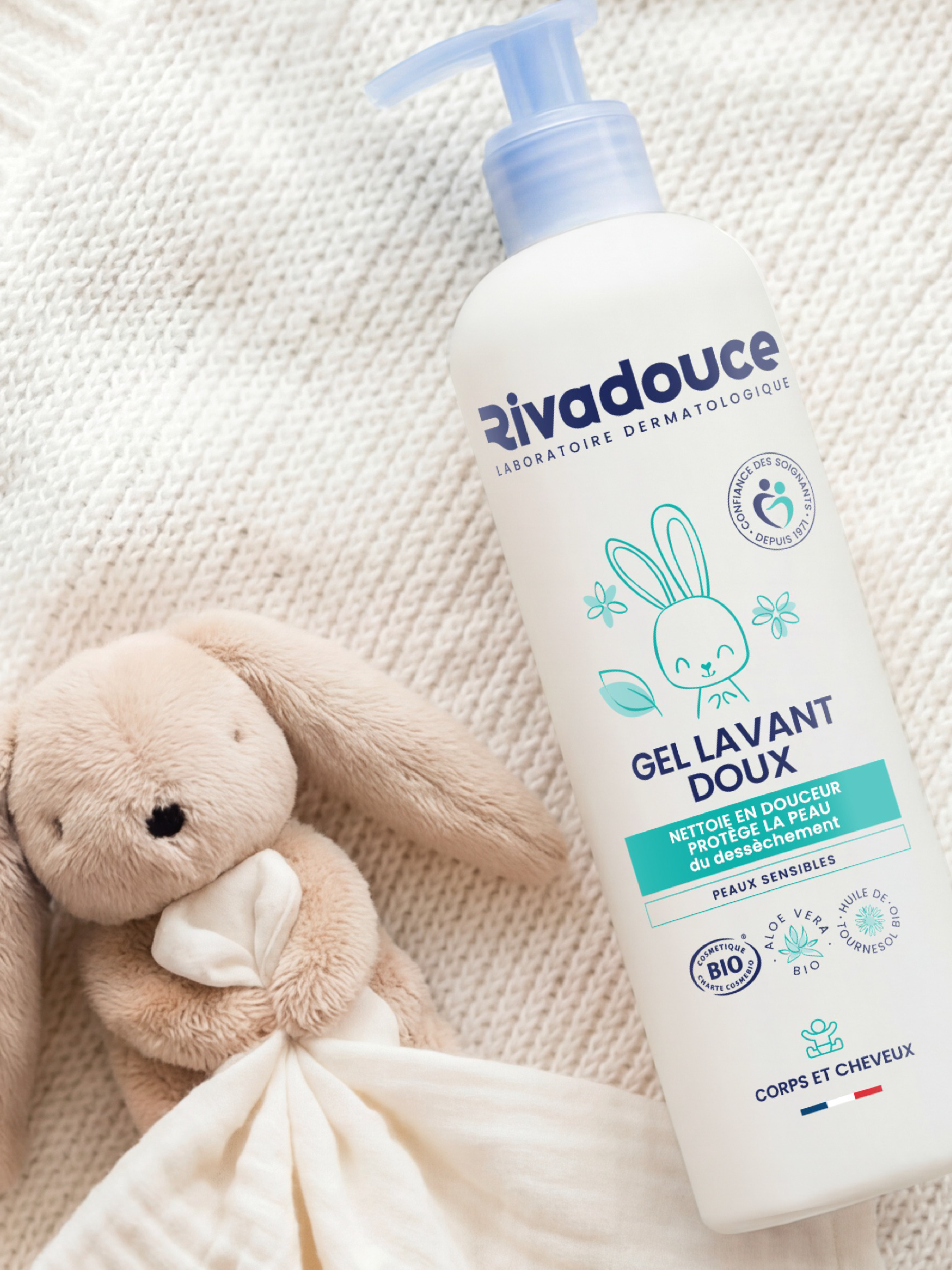
Nattō supports Rivadouce in evolving the identity of its product ranges.
From iconic baby care products to solutions designed for seniors, we reimagined the brand codes to create a more cohesive, clear and recognisable portfolio.
The work focused on building a consistent and distinctive brand language, able to adapt to very different audiences, uses and needs while maintaining a strong Rivadouce identity throughout.
Range architecture, graphic codes, information hierarchy: every detail was carefully considered to improve clarity, strengthen recognition and establish a powerful identity across the entire portfolio.
At the heart of the project was an additional challenge: strengthening trust among healthcare professionals. Nattō therefore created a dedicated pictogram, a clear visual cue designed to convey the endorsement and expertise of healthcare professionals.
A project combining branding, packaging and information design to bring one consistent identity to life, at every stage of life.
Visuals — @nattohealthcare
Vichy - Capital Soleil
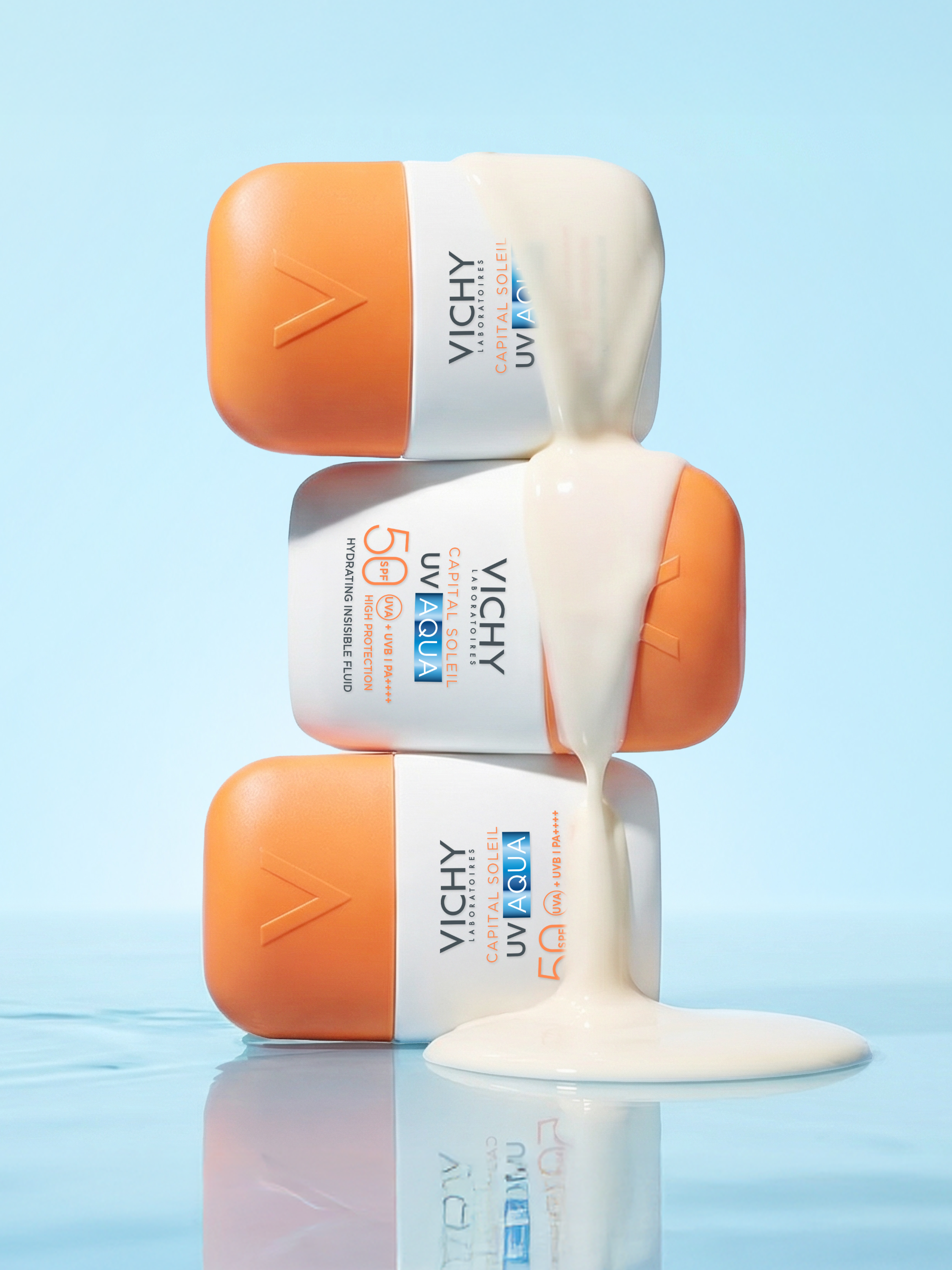
Vichy - Capital Soleil
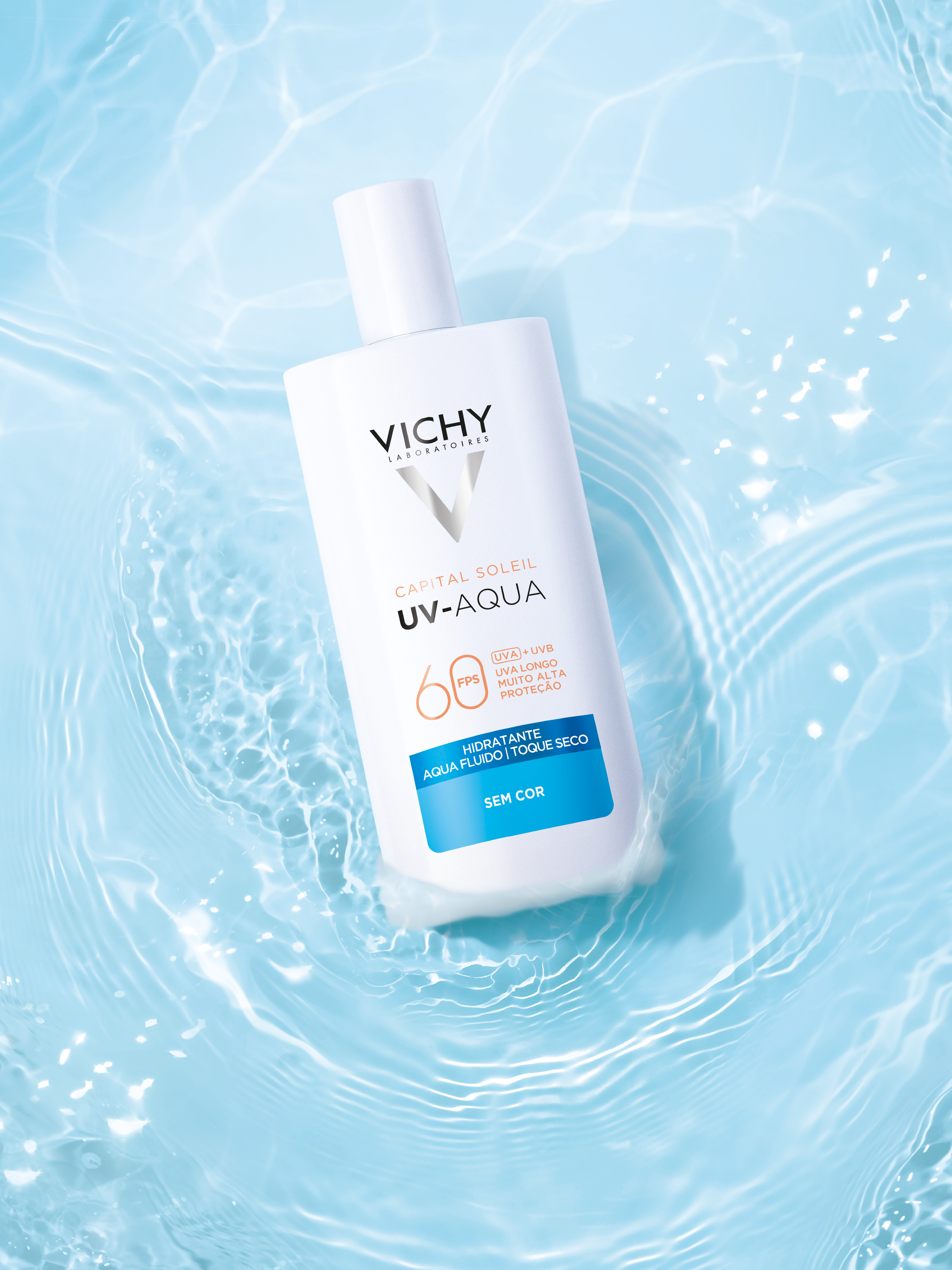
VICHY – CAPITAL SOLEIL
Nattō supported Vichy in creating the identity for its Capital Soleil UV AQUA range, a new generation of sun protection combining high protection with an ultra-sensorial experience.
The objective: convey the promise of invisible, hydrating SPF50 protection while enhancing on-shelf clarity and impact.
Nattō developed the complete packaging territory, from pack design and information hierarchy to colour choices and typography.
- An aquatic signature inspired by the lightness of water, at the heart of UV-Aqua technology
- A fresh, luminous palette combining translucent blues and textures
- A clear, structured architecture designed to instantly communicate the key benefits: SPF50 protection, hydration and invisibility
A creation that transforms sun protection into a sensory experience in its own right.
Visuals — @nattohealthcare
Bab'in
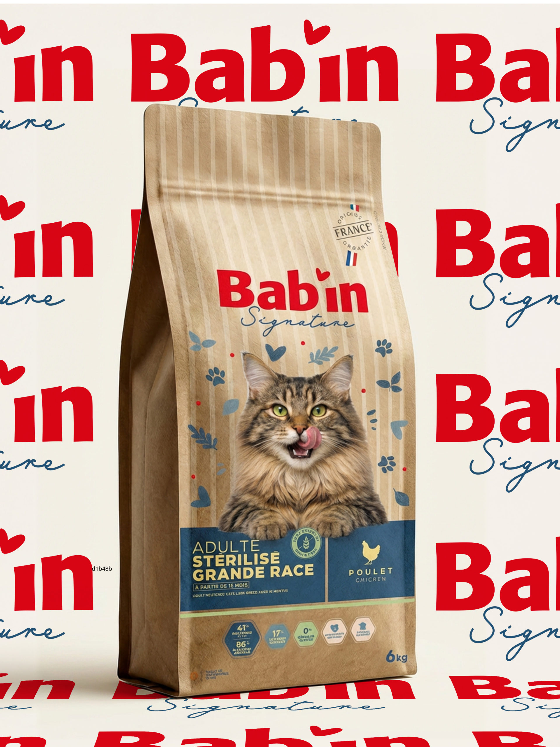
Bab'in
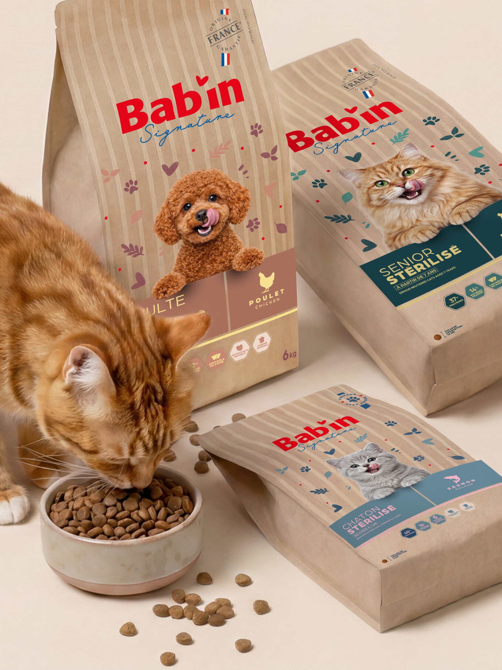
BAB’IN
Nattō unveils the new brand territory for @babin_nutrition.
50 years after its creation, the French premium pet nutrition brand is opening a new chapter in its story.
The challenge for our teams: modernise Bab’in without losing what makes the brand unique — its nutritional expertise, French know-how and commitment to animal wellbeing.
We reimagined the entire brand territory and packaging system, from range architecture and product segmentation to benefit hierarchy and the expression of the brand’s expertise.
A new identity that feels more premium, more appetising and more expressive, designed to increase impact and clarity while building a stronger connection with pet parents.
A warm and distinctive universe bringing together nutritional expertise, pleasure and French gastronomy.
A new chapter for Bab’in, imagined by Nattō.
Our wellbeing expertise, right down to their bowls.
Visuals — @nattohealthcare
Humble +
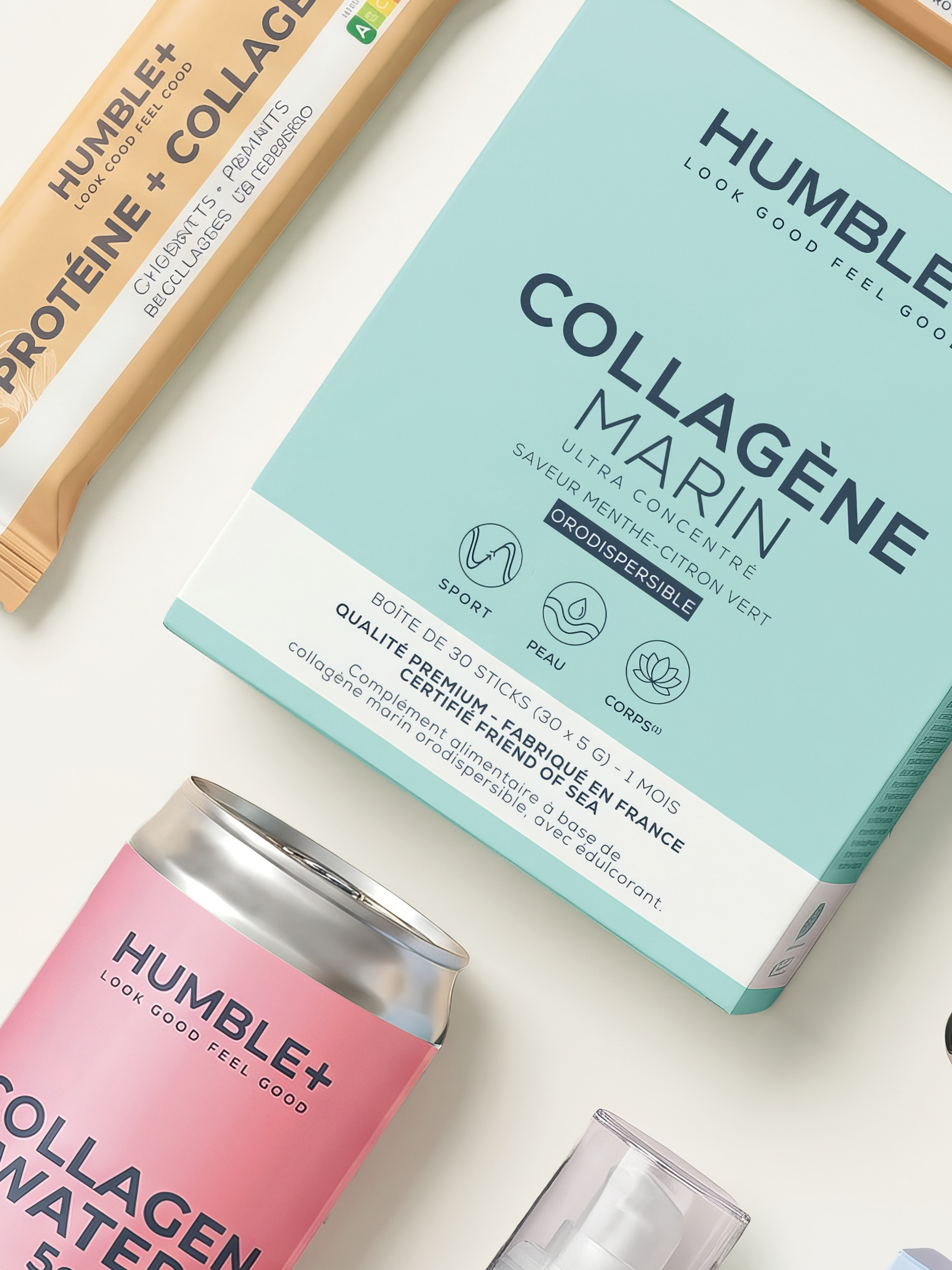
Humble +
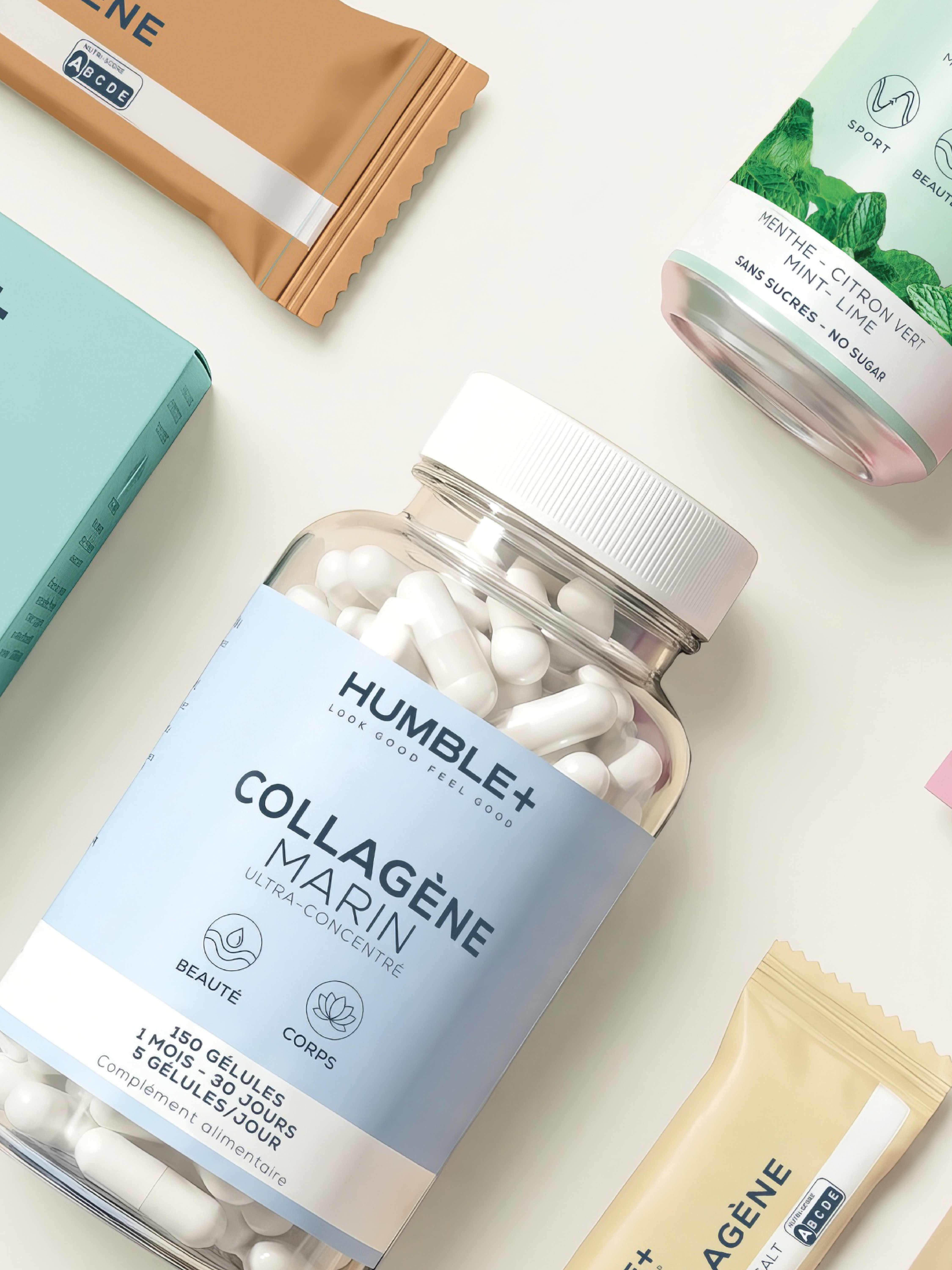
HUMBLE +
How do you create one cohesive brand story when uses, formats and categories keep expanding?
For Humble+, Nattō created a 360° brand universe, bringing collagen, creatine, nutrition and skincare together under one unified identity.
A new brand narrative.
A reimagined range architecture.
A colourful, vibrant and dynamic packaging identity.
Colour palette, pictograms, information hierarchy and graphic codes: every detail contributes to a shared visual language that is instantly recognisable, while allowing each product to retain its own personality.
The result? A range that no longer simply coexists. It becomes a brand.
Visuals — @nattohealthcare
Vichy - Neovadiol Longevity
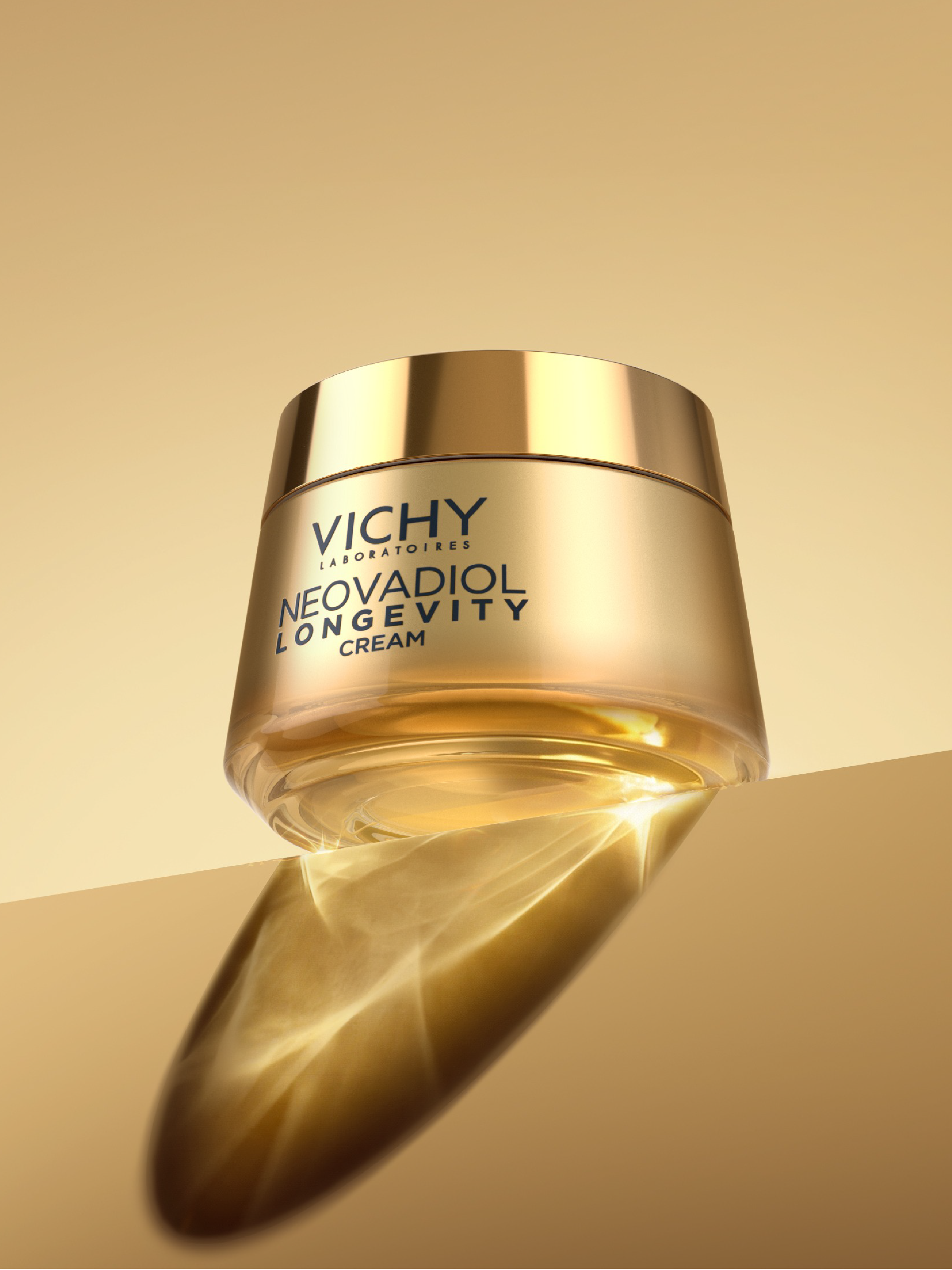
Vichy - Neovadiol Longevity
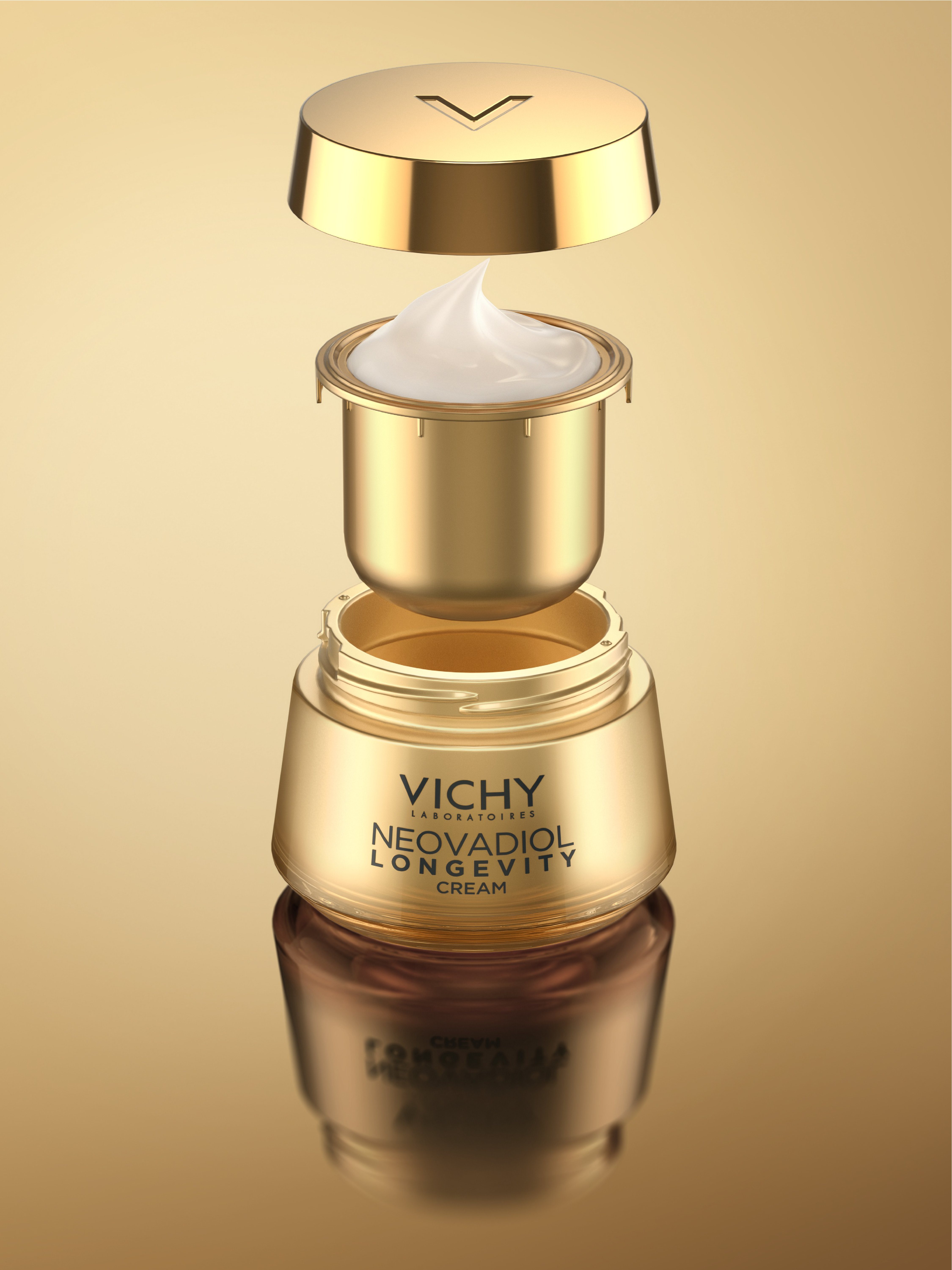
VICHY – NEOVADIOL LONGEVITY
Building on the work initiated for Collagen 16, Nattō continues its collaboration with Vichy, bringing a new level of premiumness to Neovadiol.
A design created for mature skin, where every detail matters.
Precise colour work, carefully balanced reflections and sophisticated finishes: the packaging becomes a true skincare object in its own right.
Warm gold, controlled transparency, texture brought to the forefront. A visual language that conveys performance, sensoriality and value.
Designing dermo-premiumness.
Visuals — @nattohealthcare
Topicrem - Baby
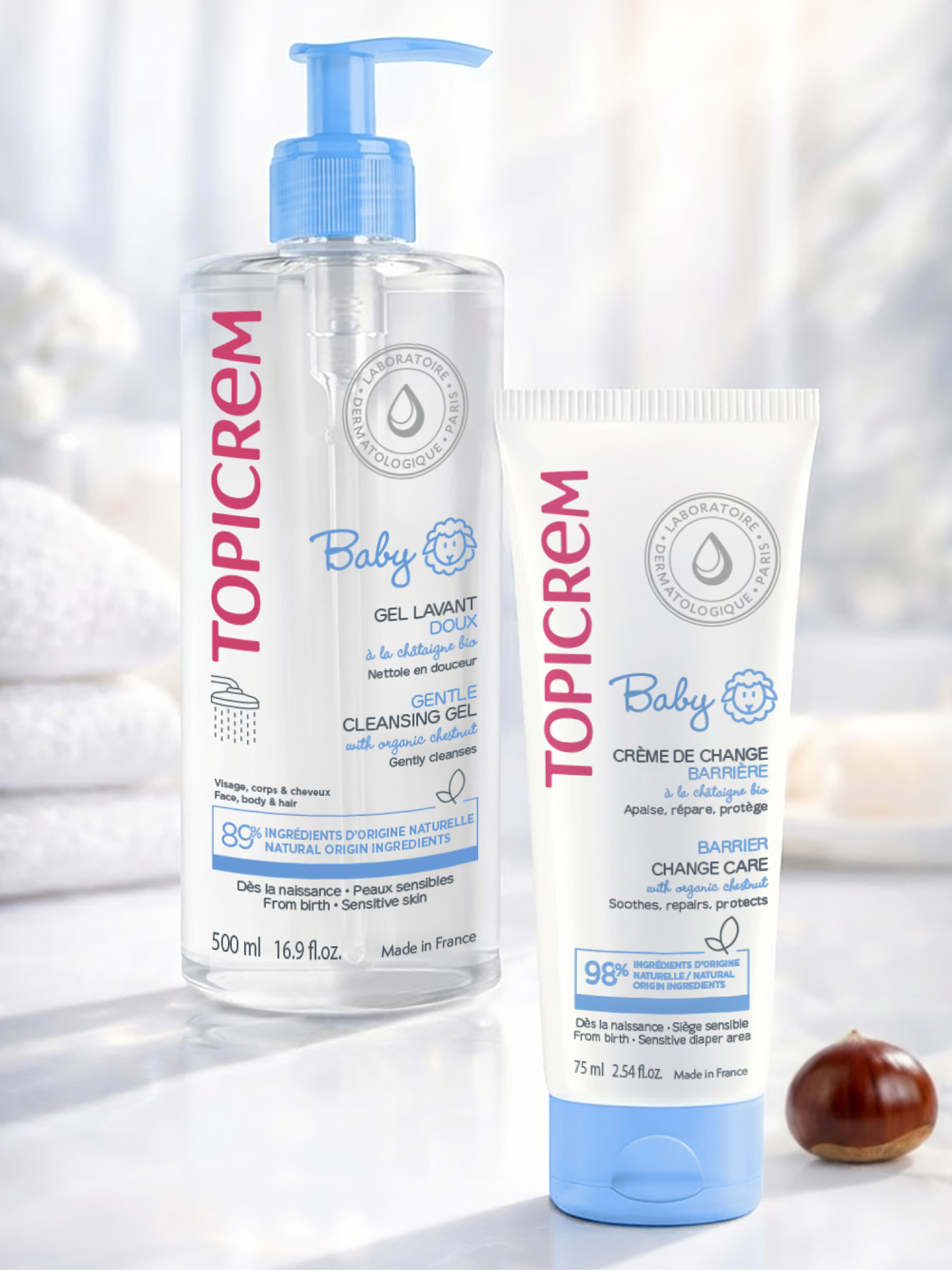
Topicrem - Baby
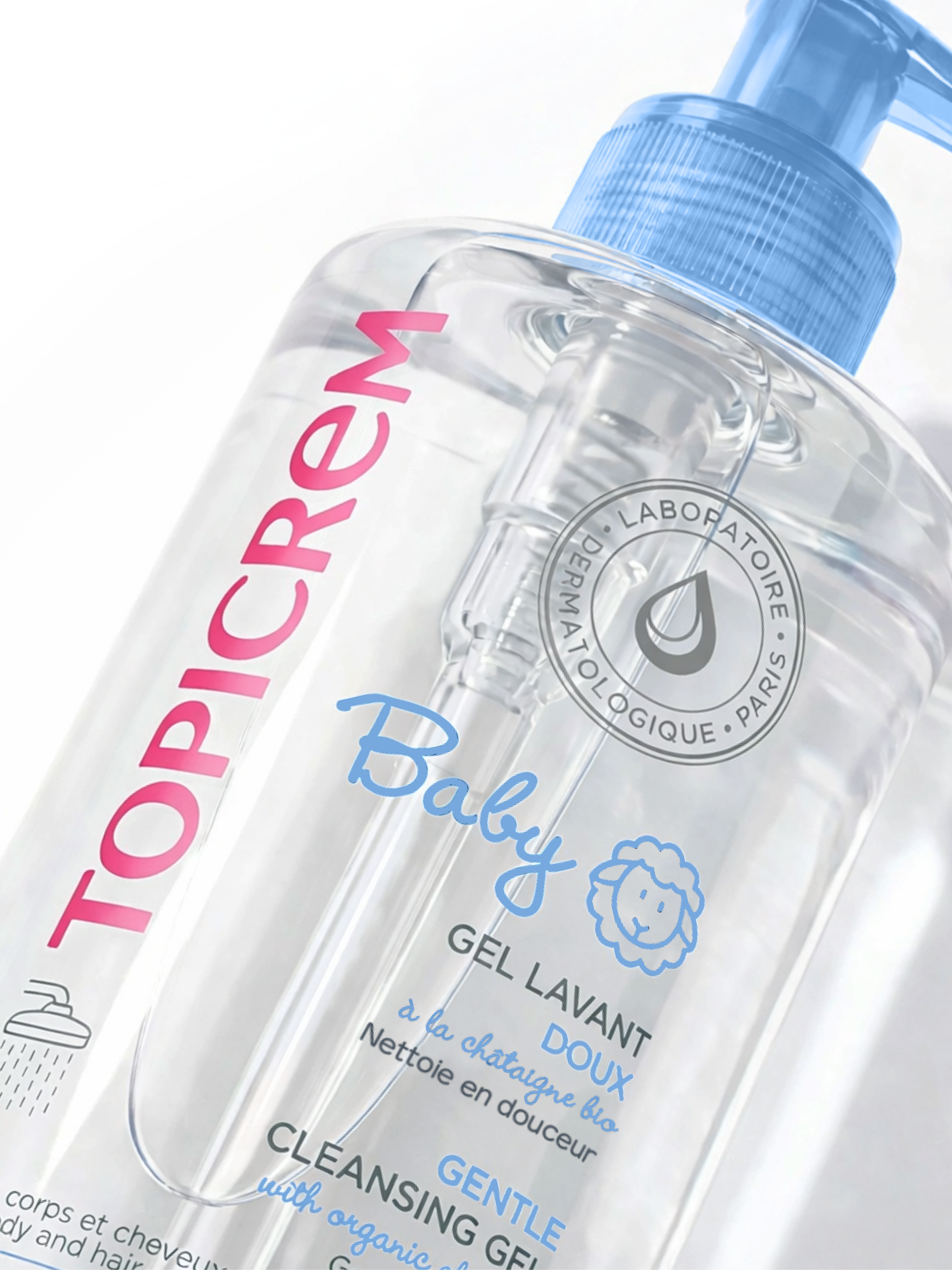
TOPICREM – BABY
Nattō supported Topicrem in creating the identity for its new dermocosmetic range dedicated to the sensitive skin of babies and young children.
Designed for use from birth, the range features five essentials that place gentleness, safety and trust at the heart of every routine.
Our creative approach:
To visually convey Topicrem’s dermatological expertise while creating a reassuring, accessible and instantly understandable emotional territory.
- A clean, transparent design to express the purity and tolerance of the formulas
- A soft, fresh colour palette combining clinical white with soothing blue
- Simple, educational graphic codes to guide product use
- A distinctive, almost affectionate “Baby” signature that creates an emotional connection without feeling overly childish
A wonderful collaboration built around a shared mission: bringing gentleness, confidence and smiles to babies… and their parents.
Visuals : @nattohealthcare & @topicrem_france
Noty
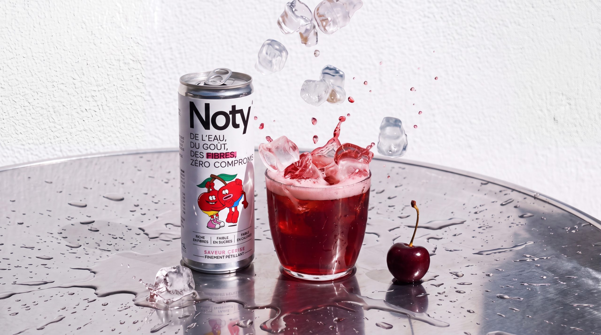
Noty
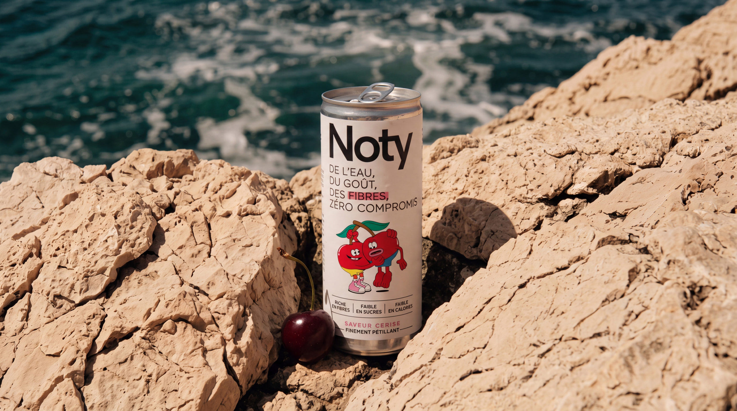
NOTY
Fines Gueules supports NOTY, a new player in the functional drinks market, in building its brand identity and designing its first brand assets.
The agency worked on information hierarchy and optimised the can design to increase the visibility of the product benefits and make the range easier to understand at point of sale.
Beyond packaging, Fines Gueules also supported the brand in developing its communication materials and a dedicated textile design.
An exclusive illustration blending vintage influences with a timeless aesthetic was created to bring the NOTY identity to life.
Design by @wearefinesgueules, powered by AI.
Milical
Milical
MILICAL
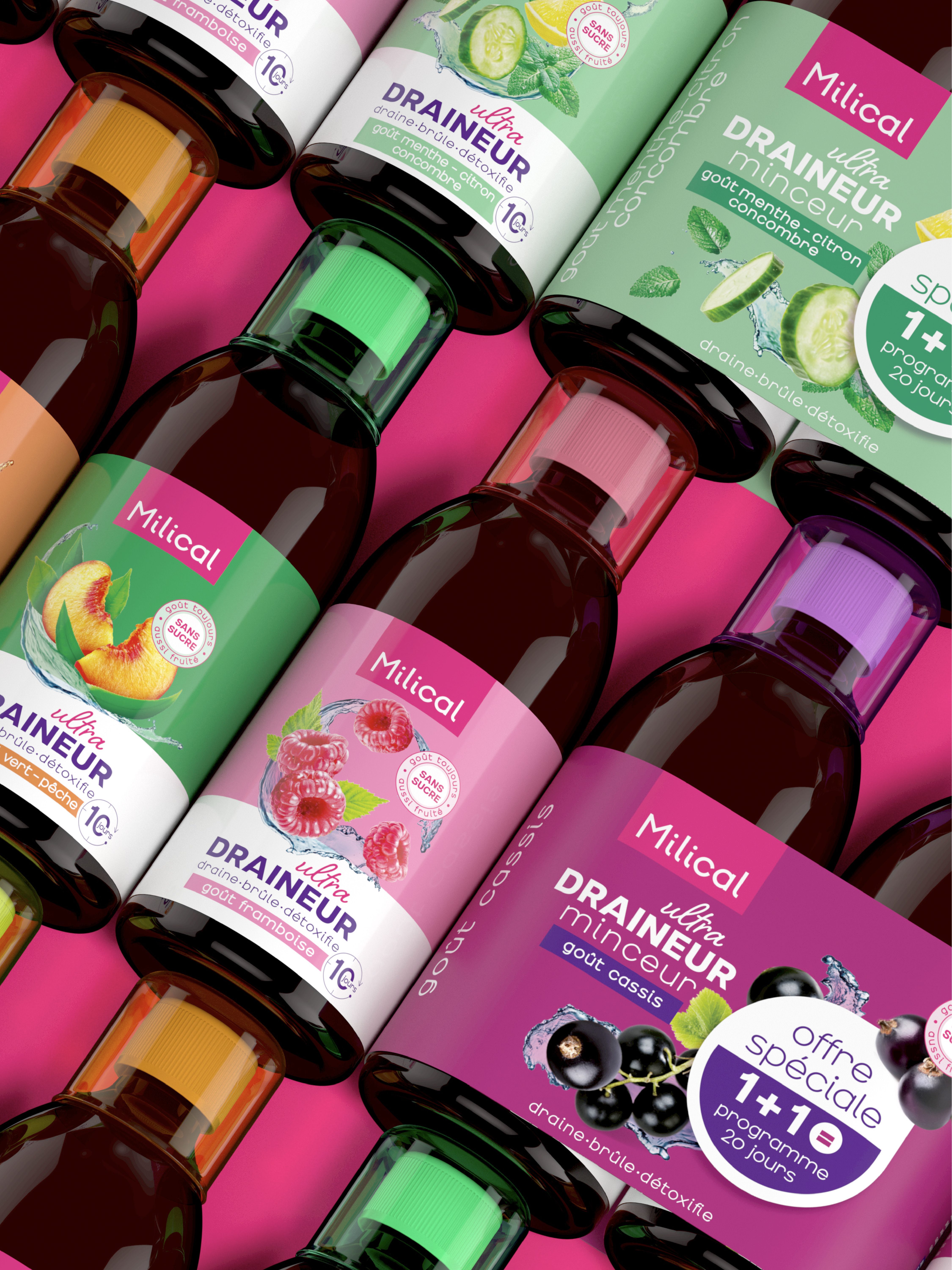
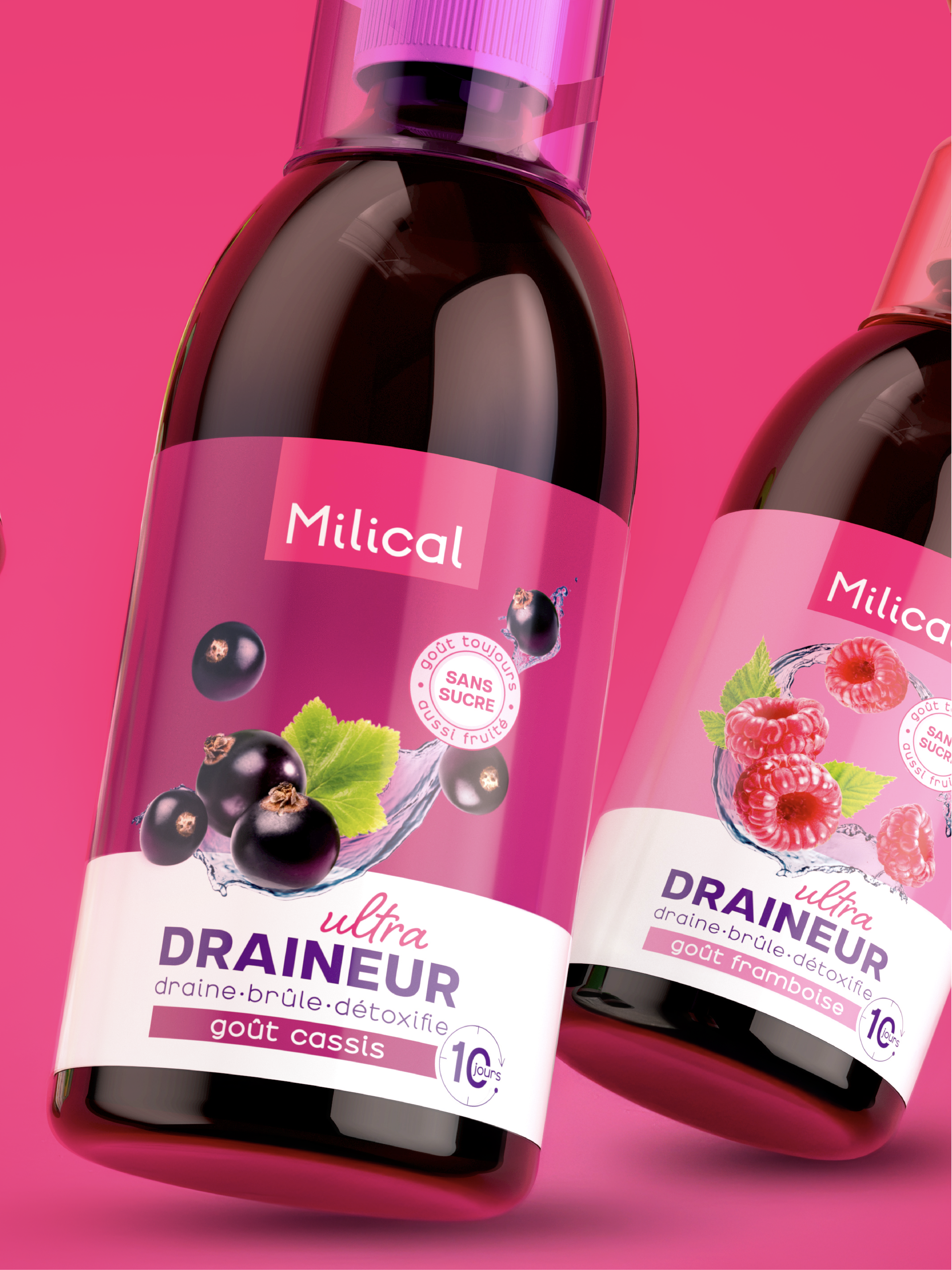
Milical, a brand specialising in nutritional products and food supplements sold in pharmacies and drugstores, entrusted Nattō with the redesign of its Detox & Drainage range.
The challenge for the agency was to visually translate the key pillars of Milical’s positioning: a wellbeing partner for women looking for solutions that are approachable, accessible, simple and enjoyable.
From a design perspective, the work focused on:
– restructuring and clarifying the Detox & Drainage segments
– creating greater consistency across the range, while preserving the strong identity of the Detox franchise, a cornerstone of the brand’s offering
– giving the brand greater impact and visibility through its iconic pink brand block
– developing a clear and powerful system to differentiate the different varieties, driven by distinctive colour codes
Design & Visuals — @bronson_group · @nattohealthcare
Vichy - B3
Vichy - B3
VICHY – B3
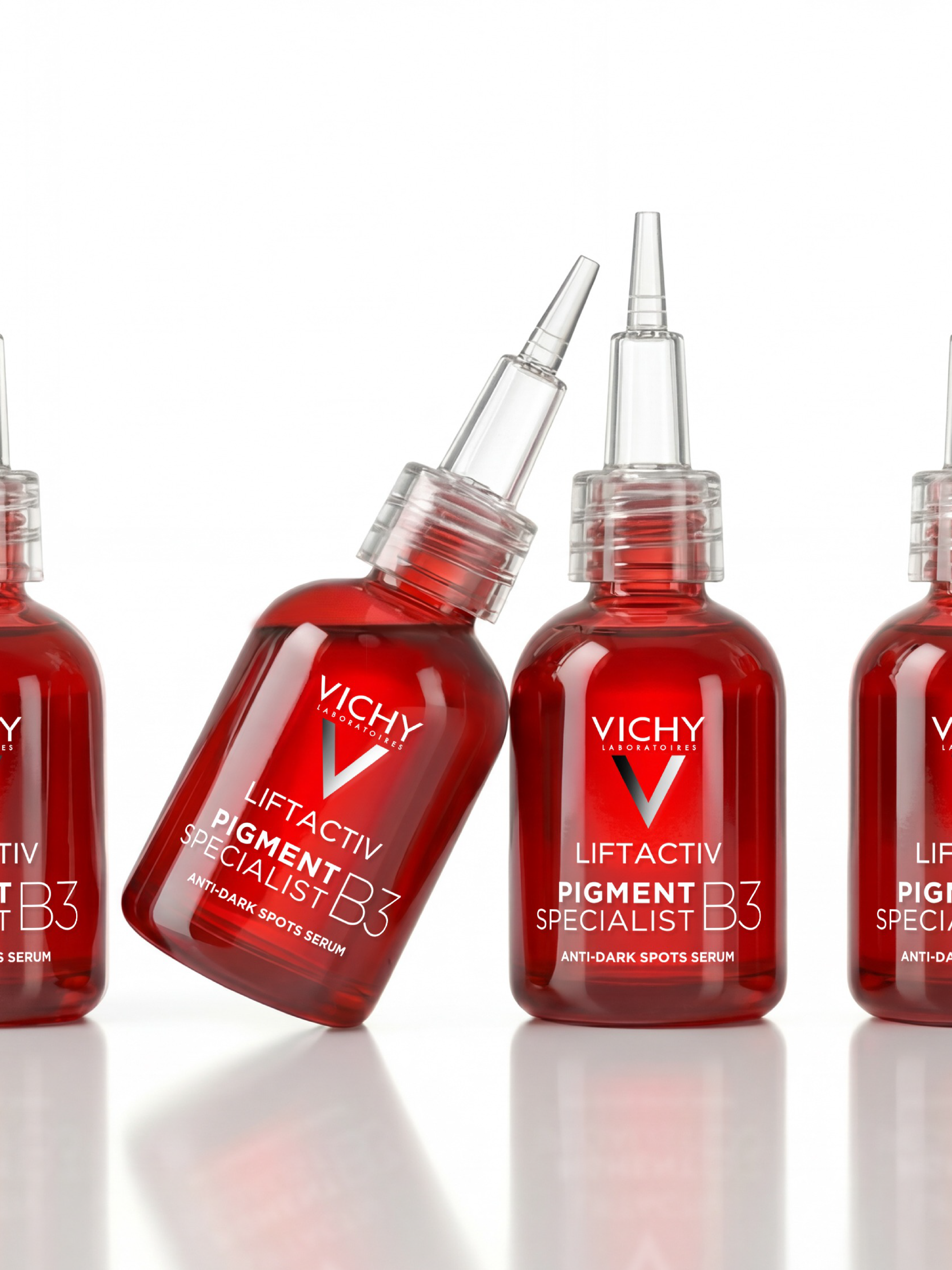
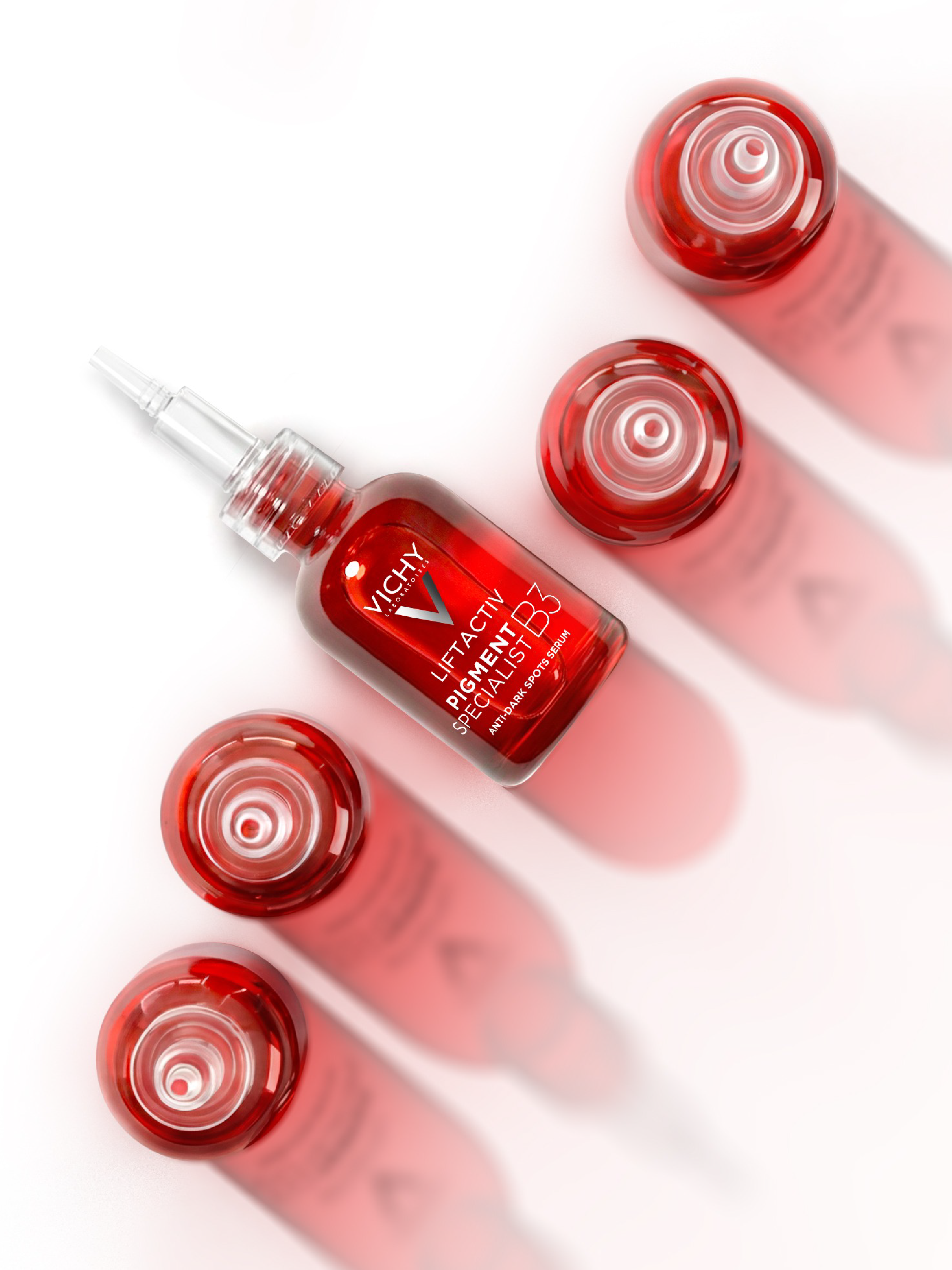
A new product joins the Liftactiv B3 range.
To support its launch, we worked alongside Vichy Laboratoires on adapting its visual territory and creating its communication assets.
The challenge: highlight the product’s anti-dark spot efficacy while seamlessly integrating it into the range’s visual universe, for which we had previously developed the graphic guidelines.
Information hierarchy, visual codes, product staging, adaptations… every asset was designed to strengthen the impact of Liftactiv B3 while ensuring perfect consistency across the entire range.
An adaptation and rollout approach that brings Vichy’s identity to life with every new launch.
Visuals — @nattohealthcare
Lustucru - Ravioles
Lustucru - Ravioles
LUSTUCRU RAVIOLES
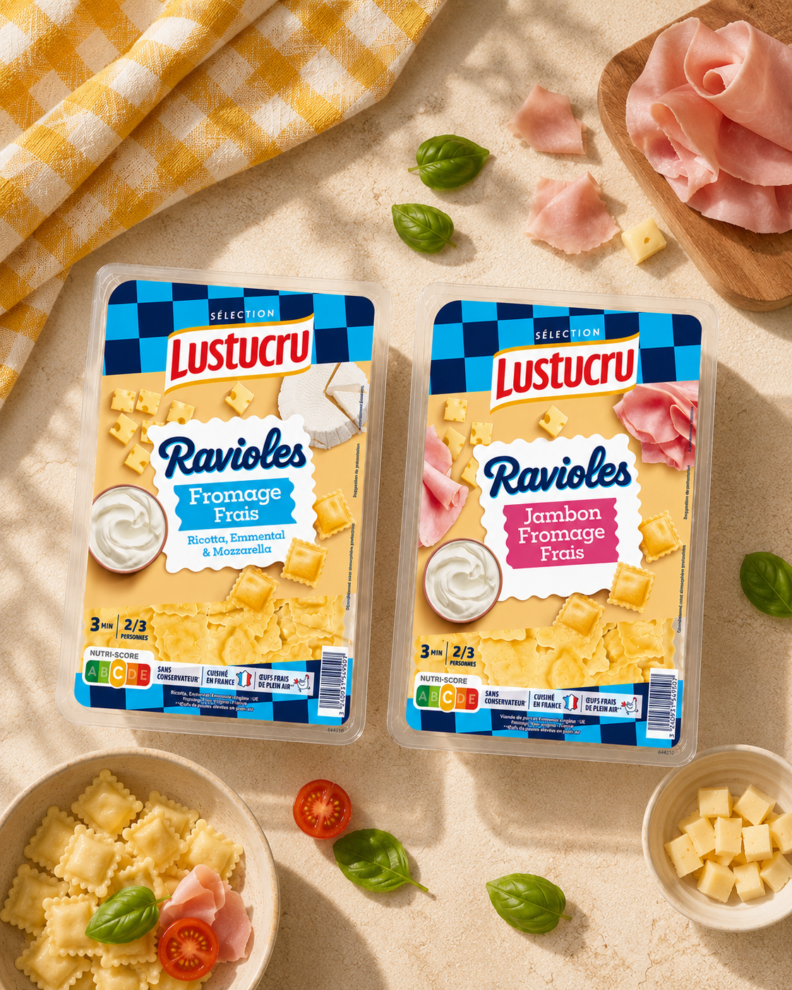
Bronson continues its collaboration with Lustucru Sélection, supporting the brand in redesigning its fresh Mini Raviolis range.
The agency has created a new design that highlights the brand’s know-how and expertise as a pasta maker.
The product has also been renamed Ravioles, a choice that reinforces the idea of small, filled pasta and better reflects the product’s identity.
This fresh and authentic new look is fully aligned with the brand’s DNA and meets consumer expectations: a simple, delicious product.
Visuals — @wearefinesgueules
Topicrem - Ultra Hydratant
Topicrem - Ultra Hydratant
TOPICREM – ULTRA HYDRATANT
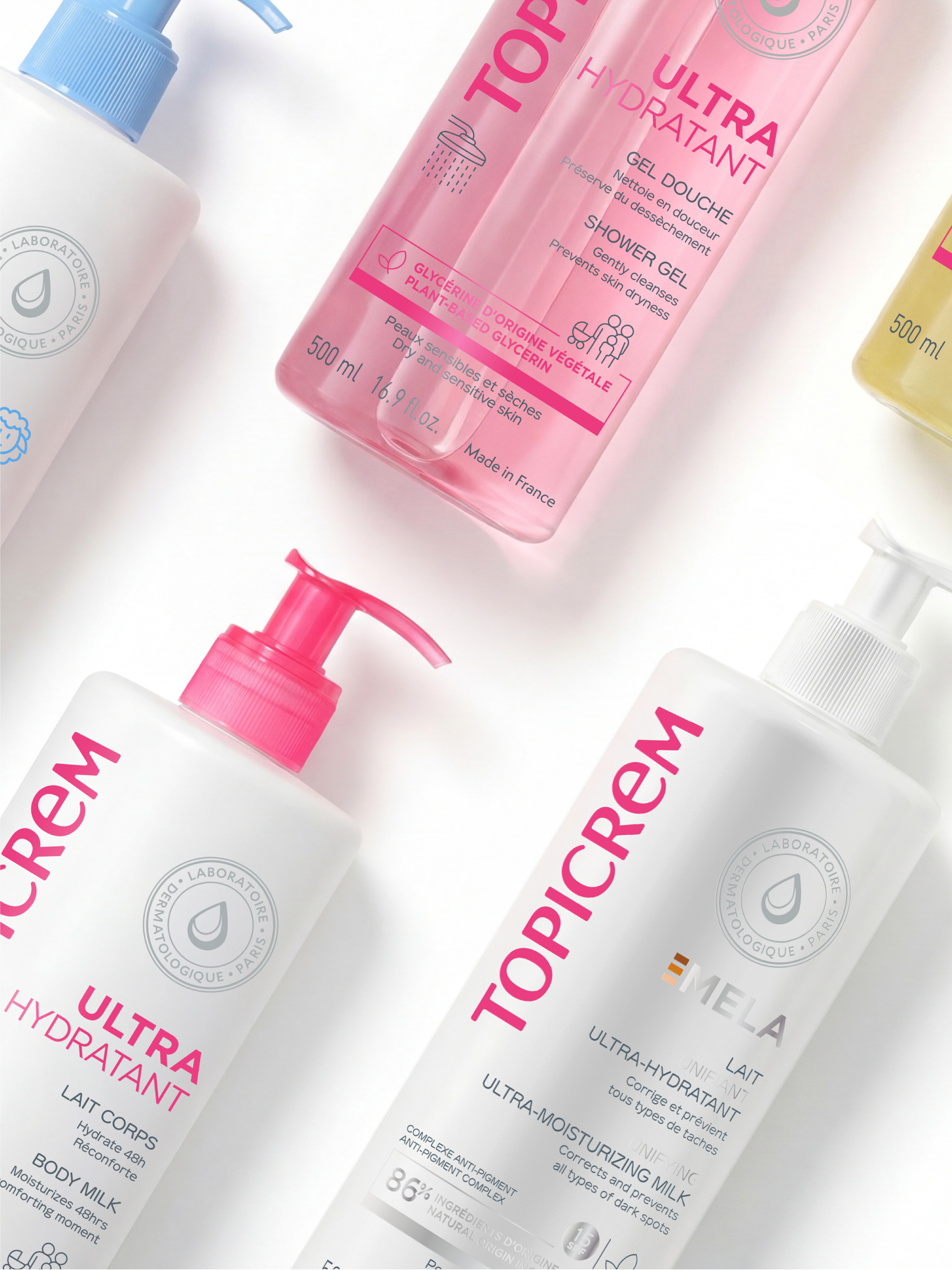
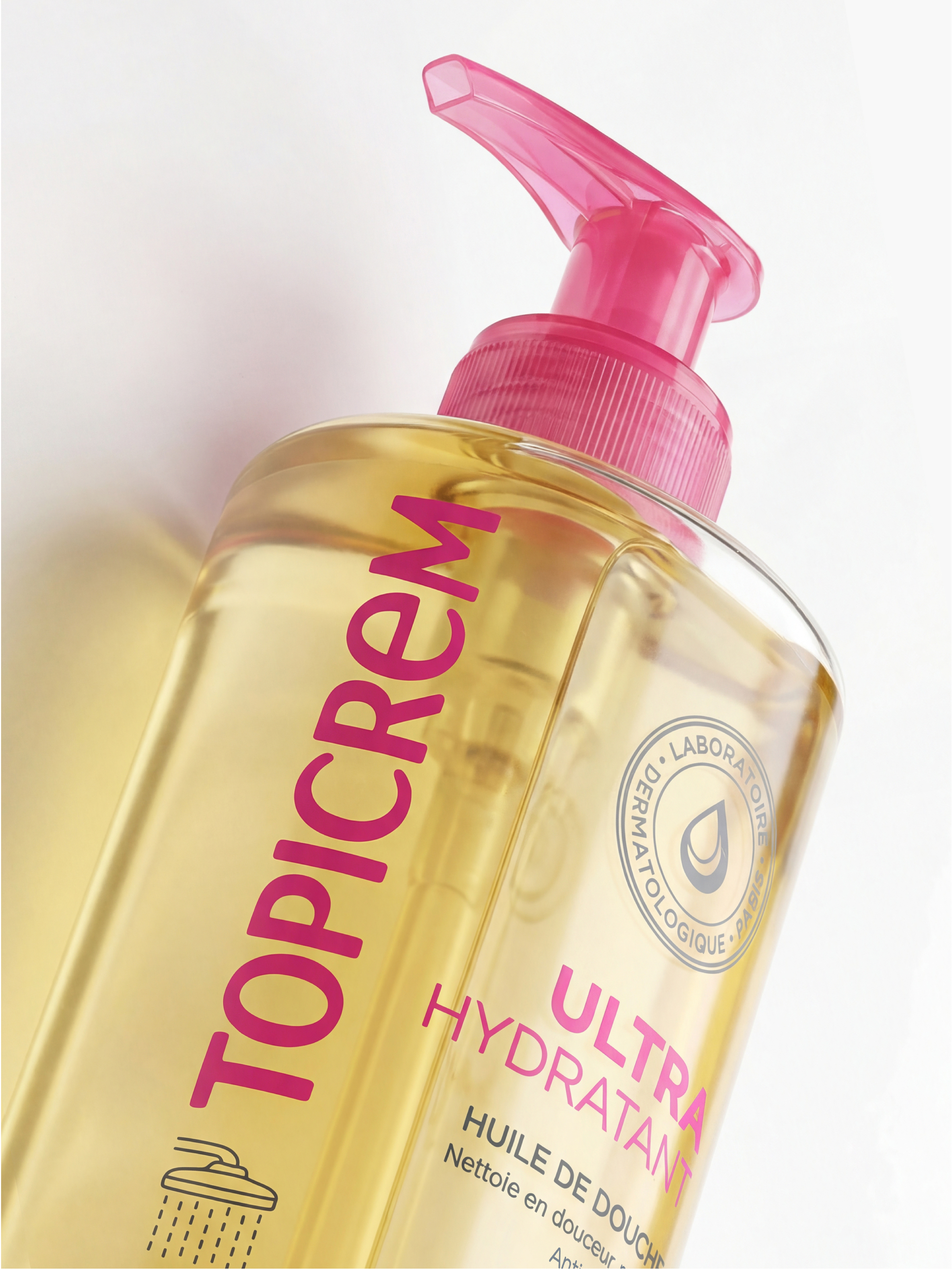
Nattō supports Topicrem, a French dermatological laboratory, in the evolution of its iconic Ultra-Hydrating range.
The objective: improve on-shelf readability, modernise the visual expression and reinforce the dermatological promise, while preserving the brand’s distinctive codes.
The agency worked on the information hierarchy, optimising key active ingredient messaging and clarifying product benefits (48-hour hydration, comfort and high tolerance).
The use of colour and typography ensures immediate product identification, with a more structured and impactful architecture designed to enhance performance.
A design that combines clinical efficacy with desirability, without compromise.
Visuals — @nattohealthcare
Lustucru - Crunchy Fondant
Lustucru - Crunchy Fondant
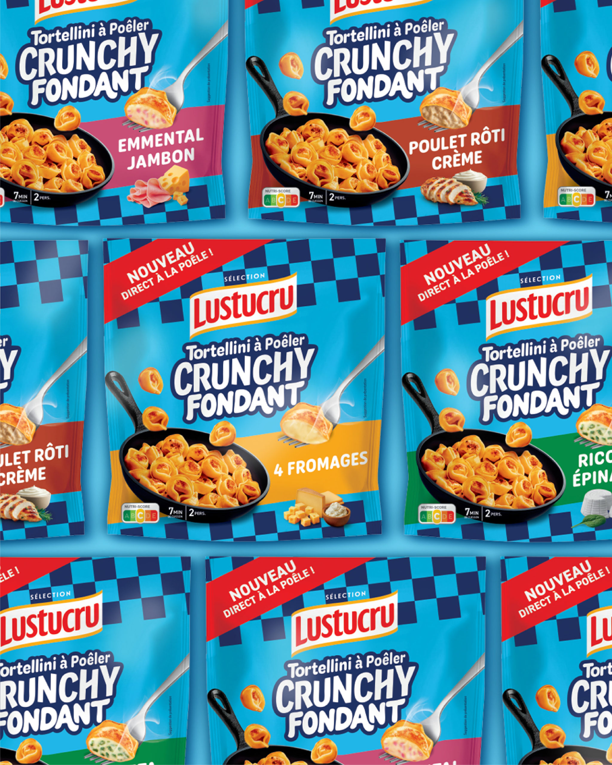
LUSTUCRU CRUNCHY FONDANT
What if we reinvented the way we cook stuffed pasta?
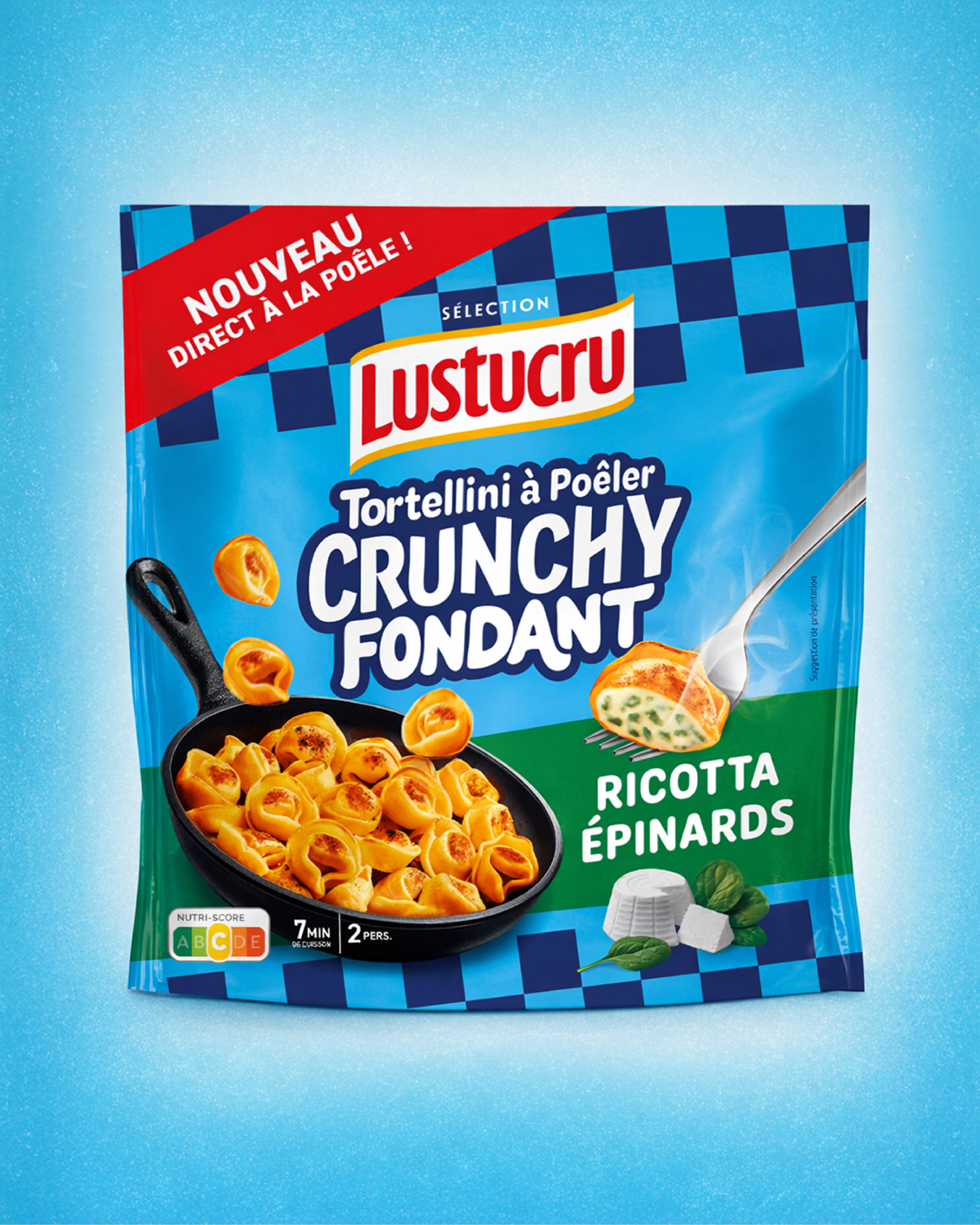
To support Lustucru Sélection, Bronson has created the identity for its new range: Crunchy Fondant.
Tortellini that sizzle, a texture that transforms: golden and crispy on the outside, soft and creamy at the core. A sensation you can almost hear, almost see.
A brand block designed like a sticker, applied with spontaneity to create a sense of closeness and catch the eye on shelf.
And when it comes to design? Impossible to miss.
A mouth-watering visual that brings the product, the cooking process and the moment to life.
A distinctive colour block that stands out on shelf, a sticker-style brand block that creates connection, closeness and, above all… desire.
A design that captures attention, makes a statement and is instantly recognisable as Lustucru Sélection.
In Crunchy Fondant we trust. What about you?
Visuals — @wearefinesgueules
Miumiu - Qixi 2026
Miumiu - Qixi 2026
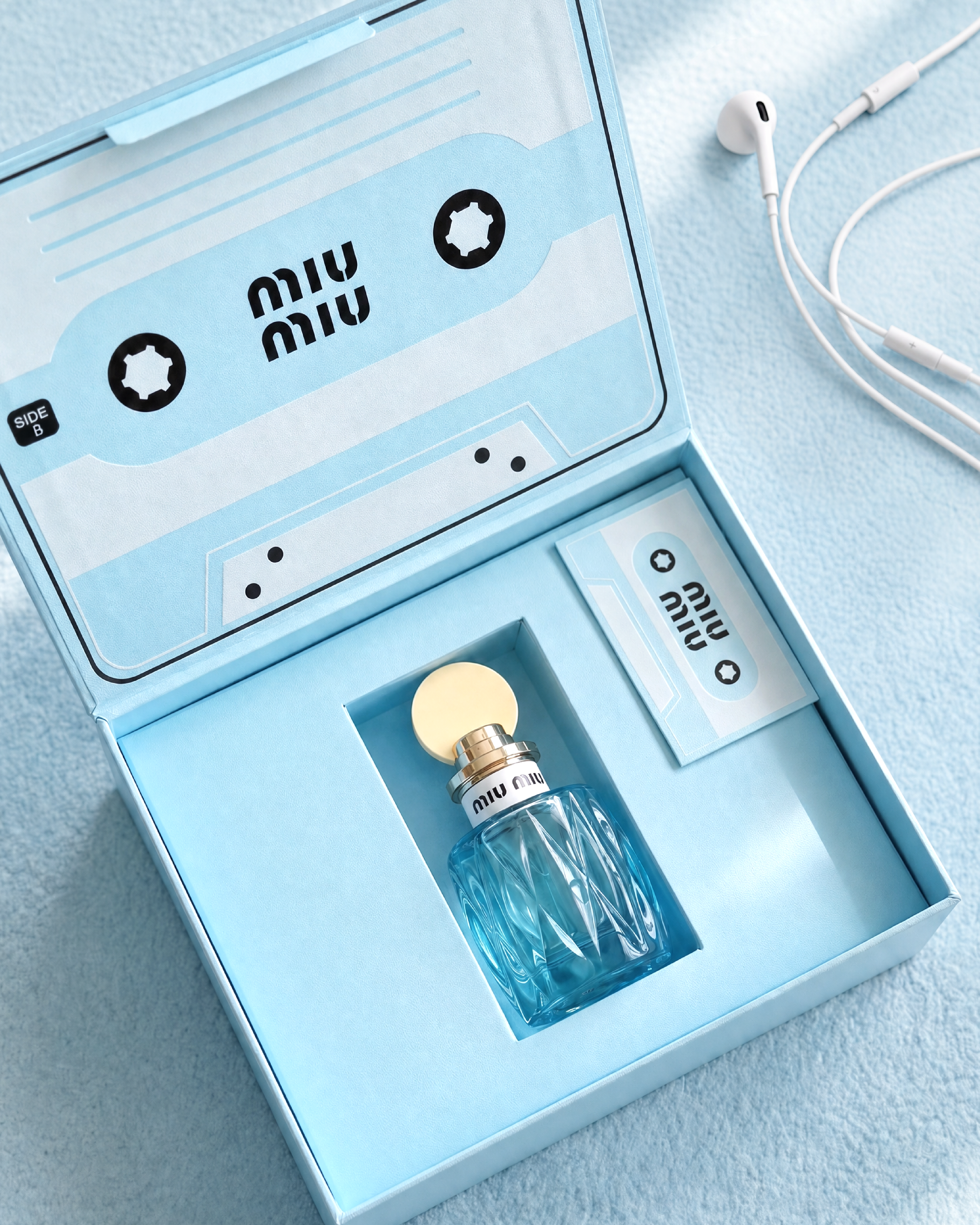
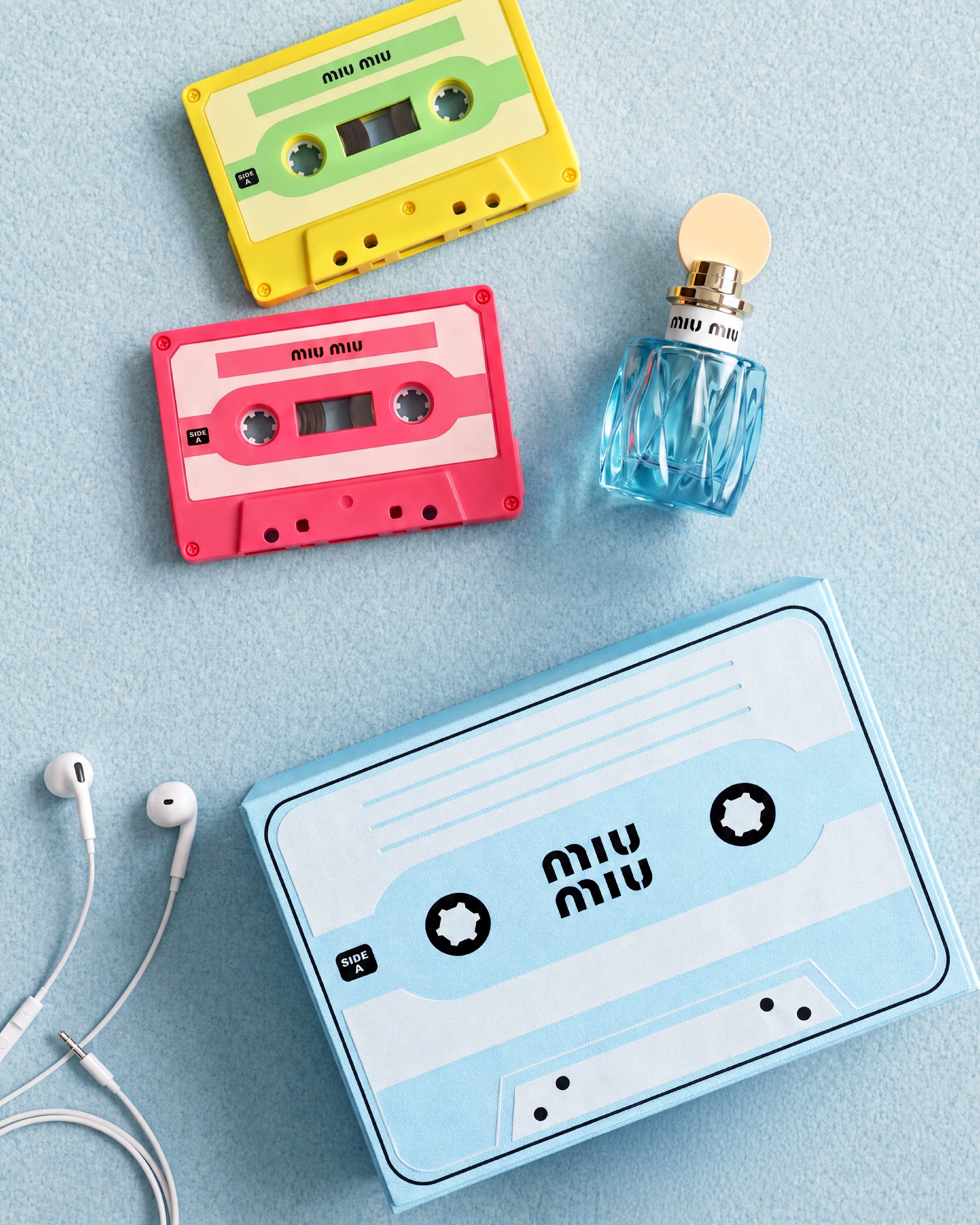
MIUMIU QIXI 2026
For @miumiu Qixi 2026, CHARLES turned a love story into something you could almost press play on.
Created for the Qixi celebration in Asia, this limited-edition fragrance box draws inspiration from the nostalgic world of the music cassette: an object made to record, preserve and replay meaningful moments.
Reinterpreted through Miu Miu’s playful and irreverent visual language, the design brings together retro references, bold graphics and the brand’s iconic Azzurro Blue, transforming the box into a collectible object with a distinctly Miu Miu attitude.
More than a packaging concept, we wanted the experience to feel like a personal recording: a scent, a memory, a summer feeling captured and kept for someone special.
A love soundtrack designed by CHARLES for Qixi — playful, nostalgic and made to be remembered.
Art Direction – Packaging Design
Visuals from @miumiu and @charlesstudio.fr
Babybel - Plant-Based
Babybel - Plant-Based
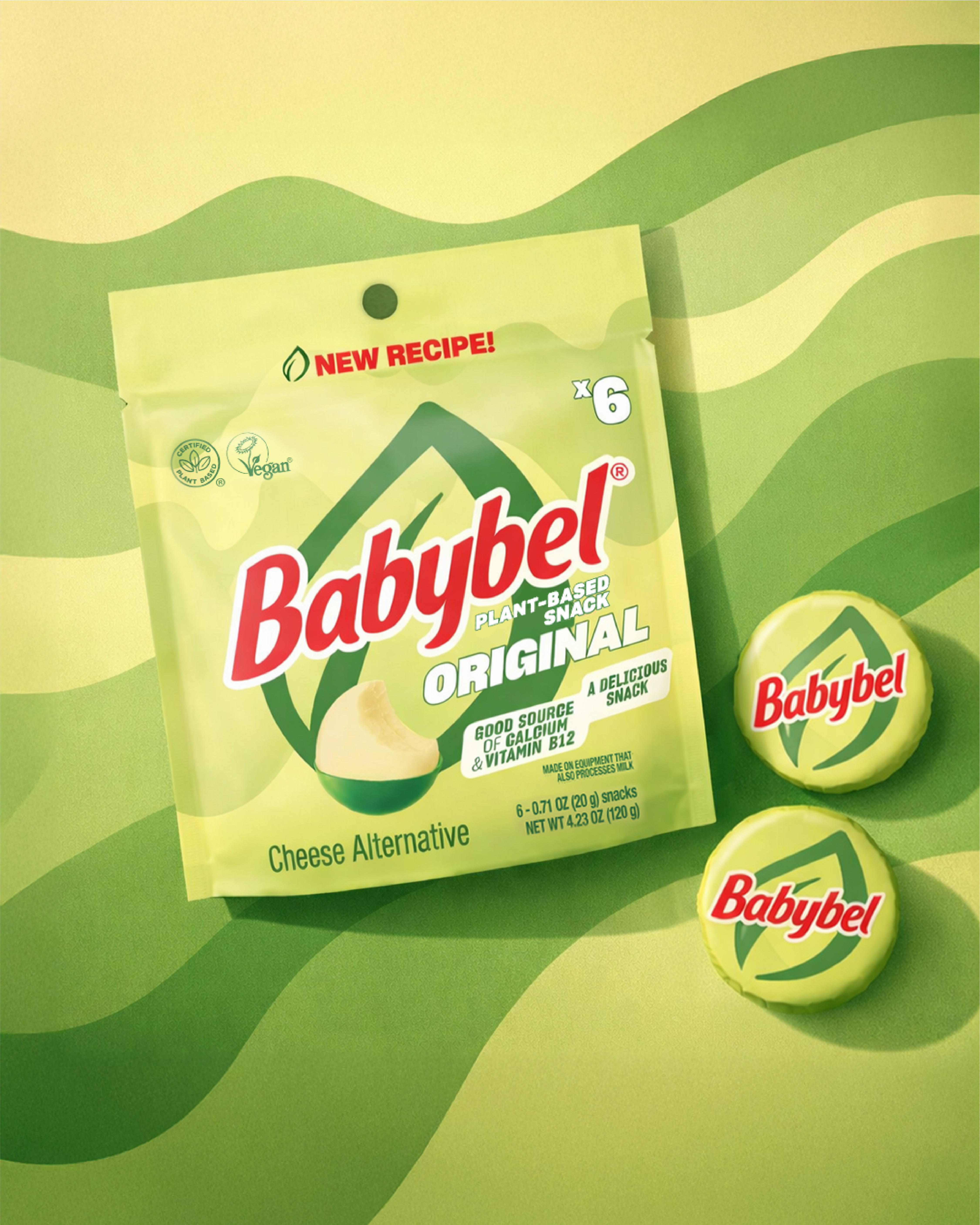
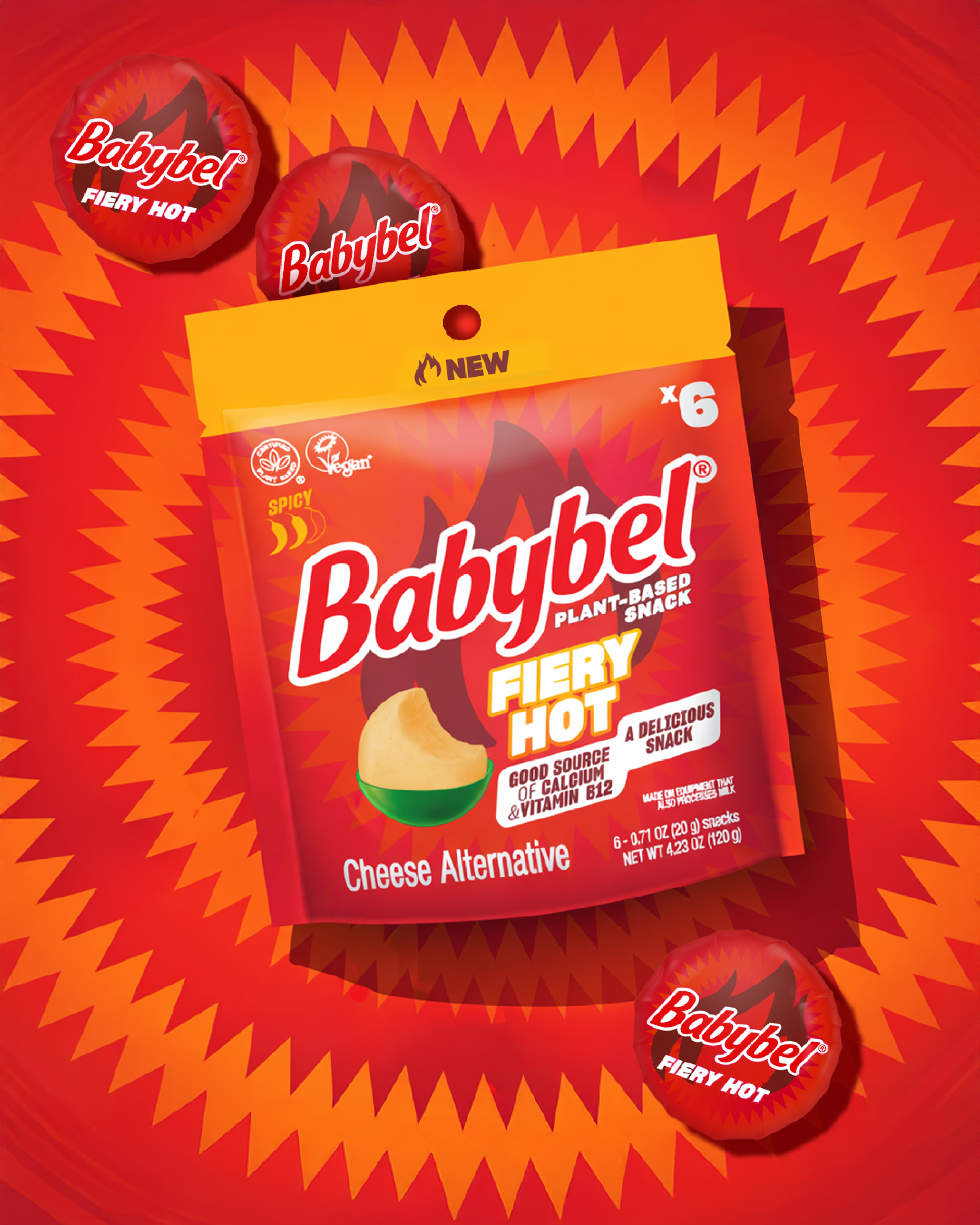
BABYBEL PLANT-BASED
Babybel is responding to evolving consumer expectations by exploring new territories.
With the launch of its 100% plant-based Babybel range (Original, Barbecue and Fiery Hot flavours in the US), the brand is expanding its offering in line with current trends, while preserving the core codes of its identity.
An innovation designed as a natural extension of the brand, at the crossroads of consumer habits, taste and purpose.
An art direction designed to support this evolution. Distinctive colours, structured graphics and a clear visual hierarchy: the design highlights the new proposition while ensuring immediate brand recognition.
Packaging becomes a powerful vehicle for brand expression, visually conveying the ambition, modernity and desirability of this new range.
[Project developed as part of the 4B alliance — @bronson_group x @agence4uatre]
Visuals — @wearefinesgueules
Biotherm X
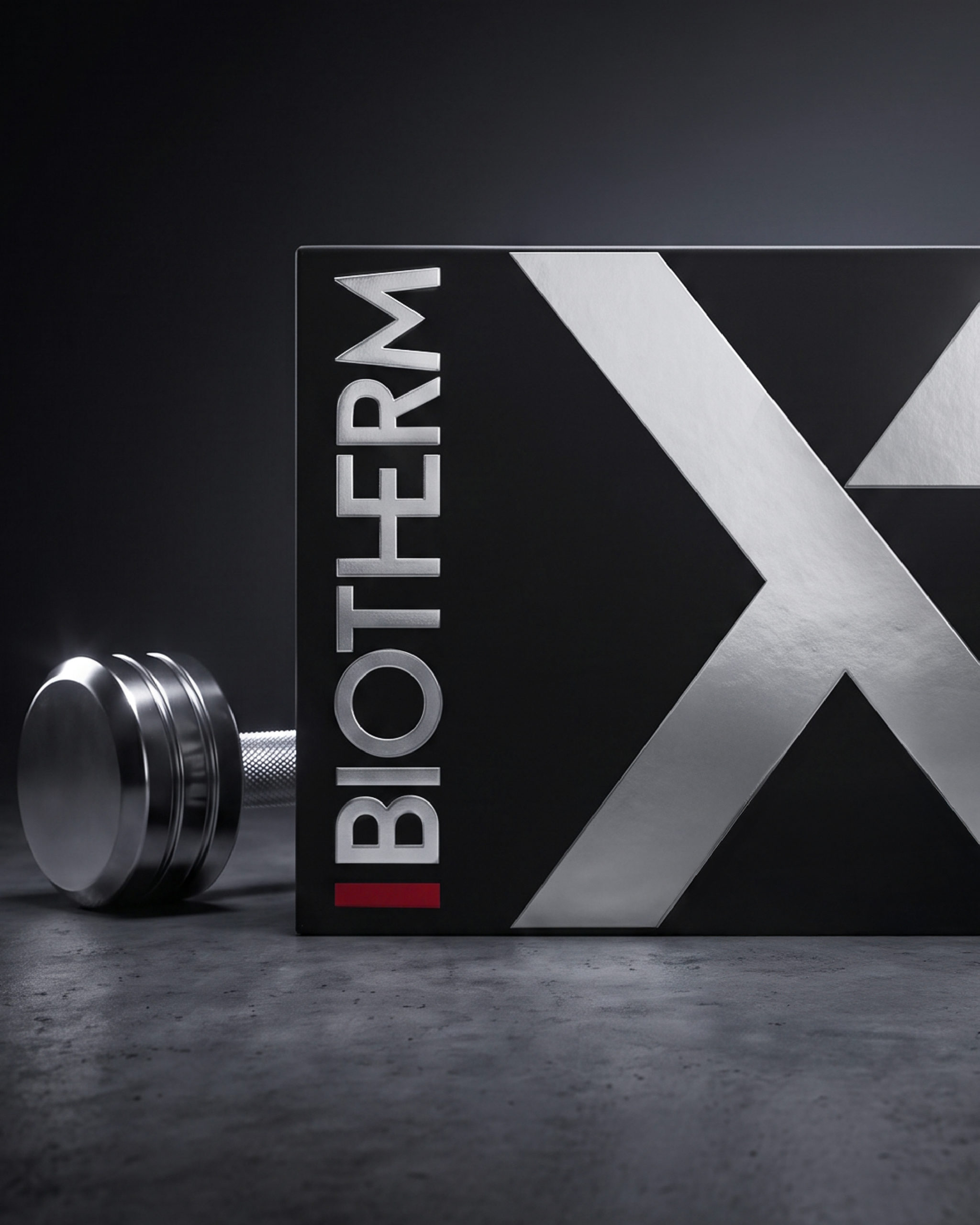
Biotherm X
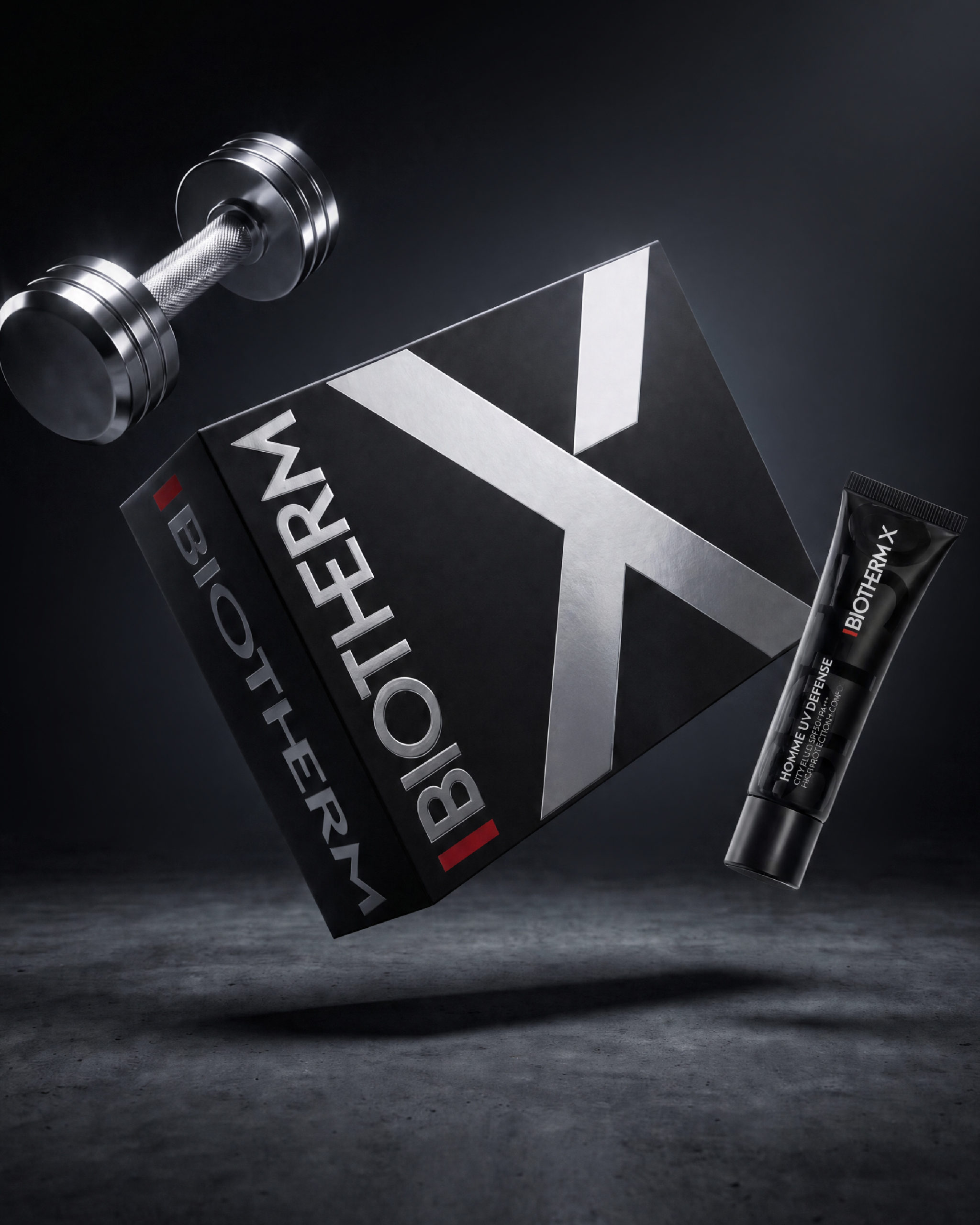
BIOTHERM X
We are proud to unveil the wrapping box for @biotherm, created for the brand’s activation in Seoul as the Official Skincare Partner of @hyroxkor.
For the launch of the new BIOTHERM X range, we developed a bold and technical gifting expression inspired by the energy, performance and intensity of the HYROX universe.
At the heart of the design, the brand’s iconic X becomes a strong visual statement. Rendered in silver hot foil against a deep black background, it brings contrast, precision and a distinctly performance-driven character to the box. A wrapping piece created to extend the BIOTHERM X experience beyond skincare, and to embody the same codes of strength, efficiency and power at the heart of HYROX.
Art Direction – Packaging Design
Visuals from @charlesstudio.fr
Miumiu - 520
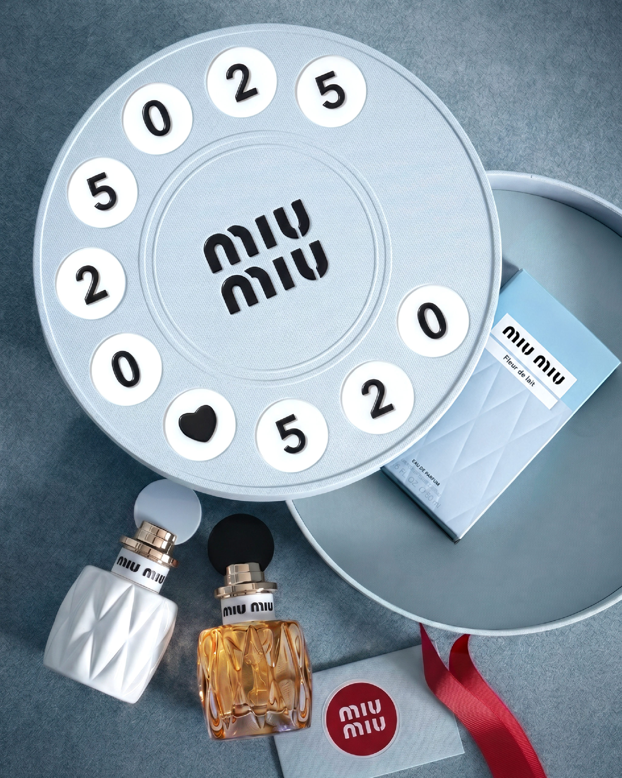
Miumiu - 520
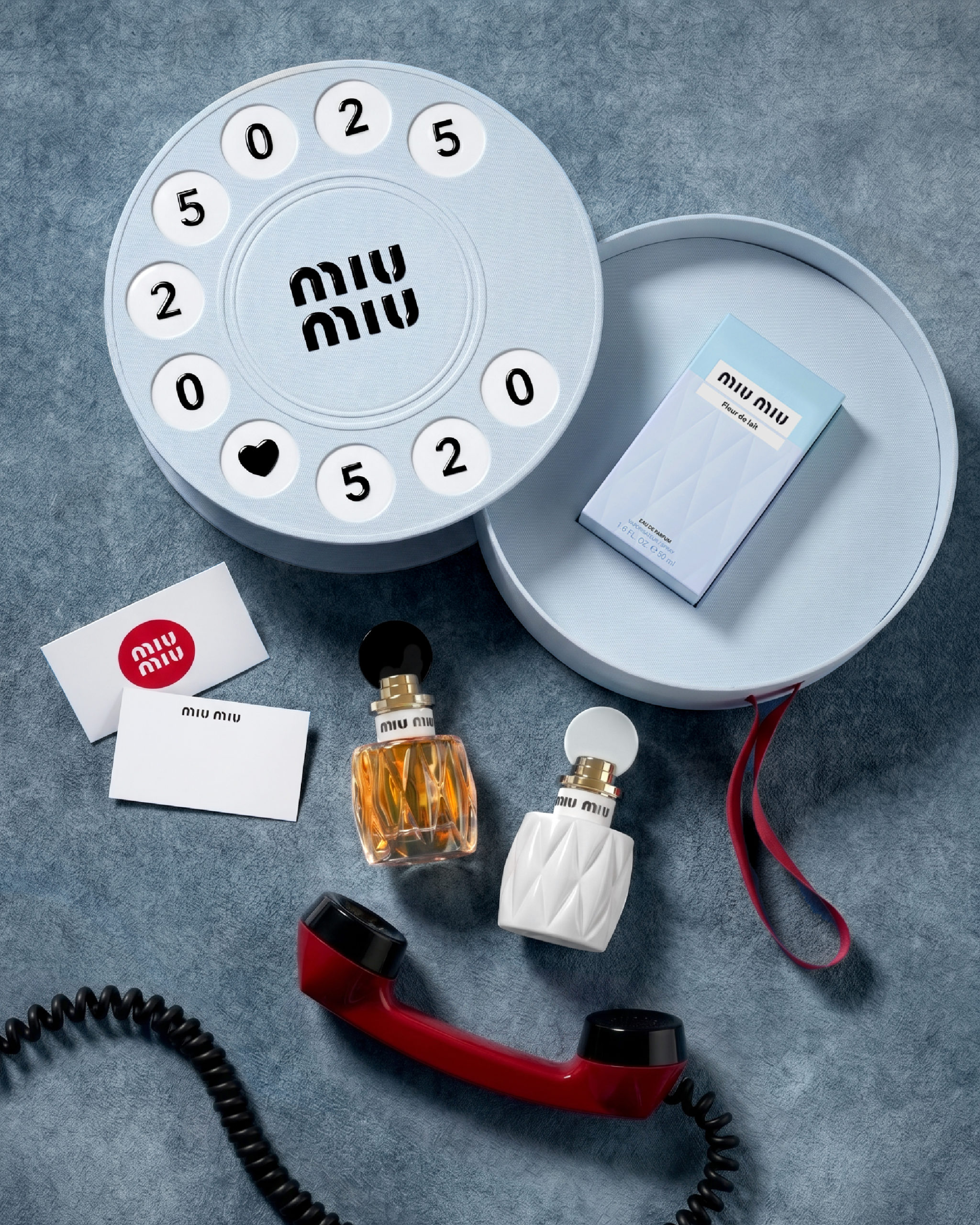
MIUMIU 520
For 520 I Love You Day, we are proud to present our collaboration with Miu Miu for an wonderfull retro phone box.
Printed on a rotating gift box, the dial invites you to enter 5-2-0, a code that resonates in China as “I love you.”
Each turn becomes a tender gesture, tuning into the silent waves of love.
As the box opens, fragrance takes over: a sensory declaration, blending retro nostalgia with a modern language of affection.
Visuals : @miumiu / @rednote.global / @charlesstudio.fr
Bellevoye
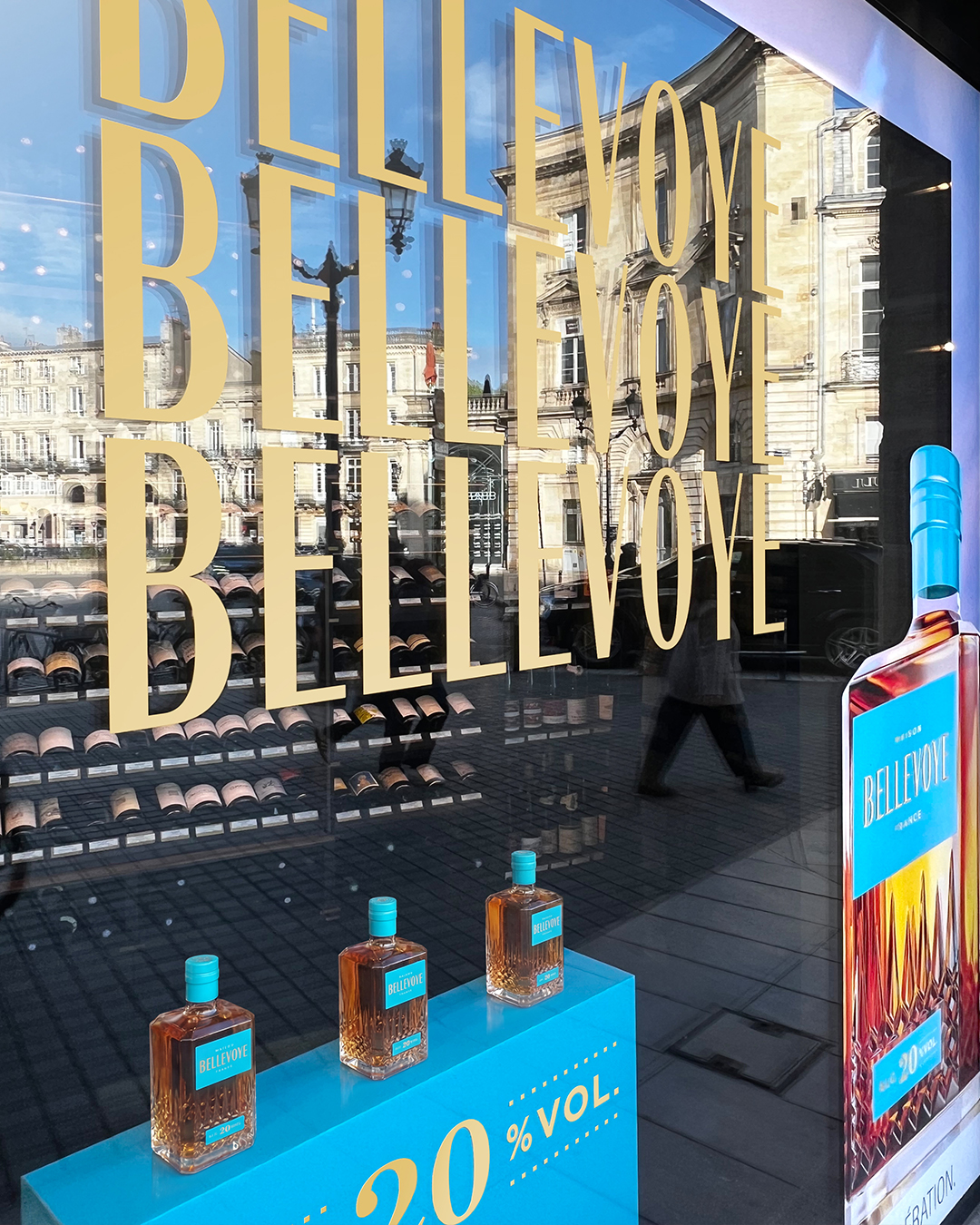
Bellevoye
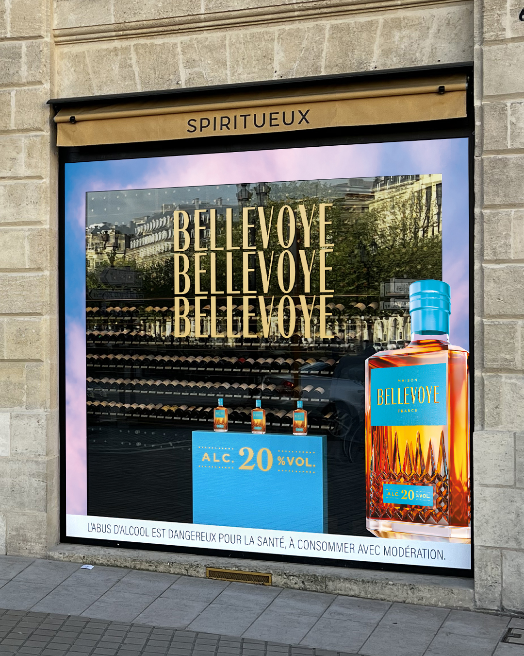
BELLEVOYE
Bronson Bordeaux designed the @bellevoye_whisky window display for the iconic Badie store in Bordeaux.
A project built around Bellevoye’s latest innovation, a 100% French whisky: the first spirit at 20% ABV, developed using an innovative infusion process.
To showcase this new release, we played with the brand’s iconic codes: its distinctive decanter, signature sky and lagoon blue, an invitation to escape.
A window display bringing together French craftsmanship, innovation and a sense of escape, designed by Bronson Bordeaux.
Visuals — @bronsonbordeaux
Trigona Conseil
Trigona Conseil
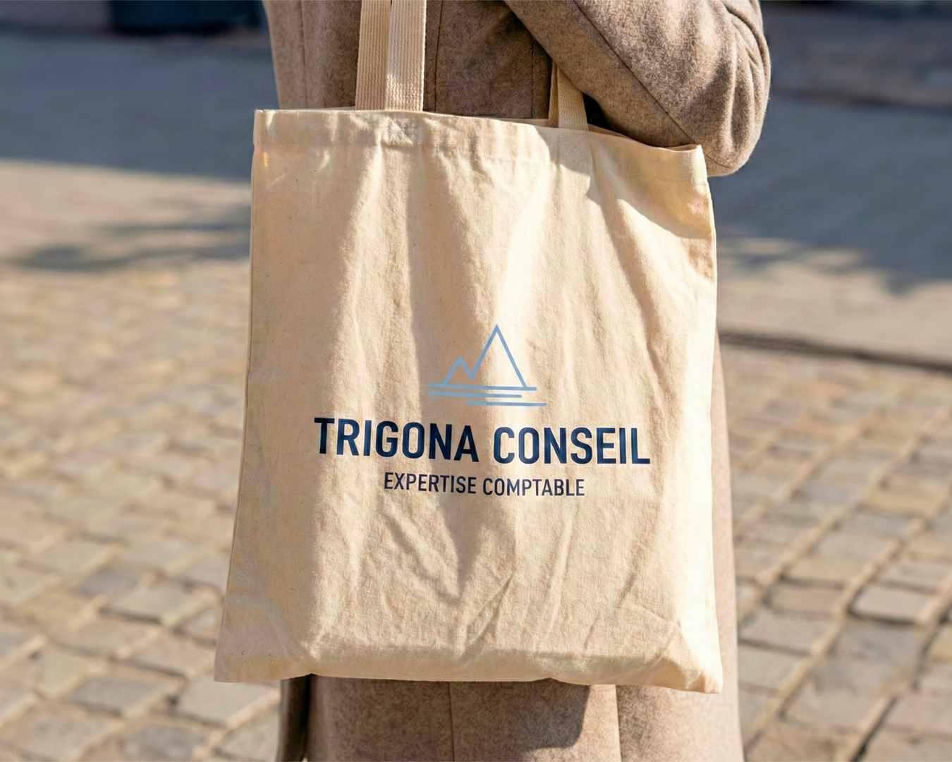
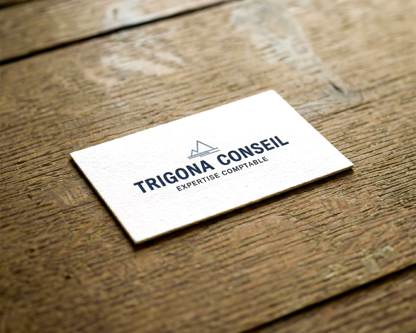
TRIGONA CONSEIL
Redesigning the visual identity of an accounting firm to support its evolution and strengthen its positioning as a trusted advisory partner.
The project is built around a strong visual concept inspired by the sea and the mountains, reflecting the firm’s two locations: Ajaccio and La Plagne.
An identity designed to create meaning, build a lasting brand and work seamlessly across every touchpoint.
At Bronson, we support notaries, lawyers, accountants and consulting firms in creating or transforming their visual identities.
Visuals — @bronsonbordeaux
Armani - Valentine's day
Armani - Valentine's day
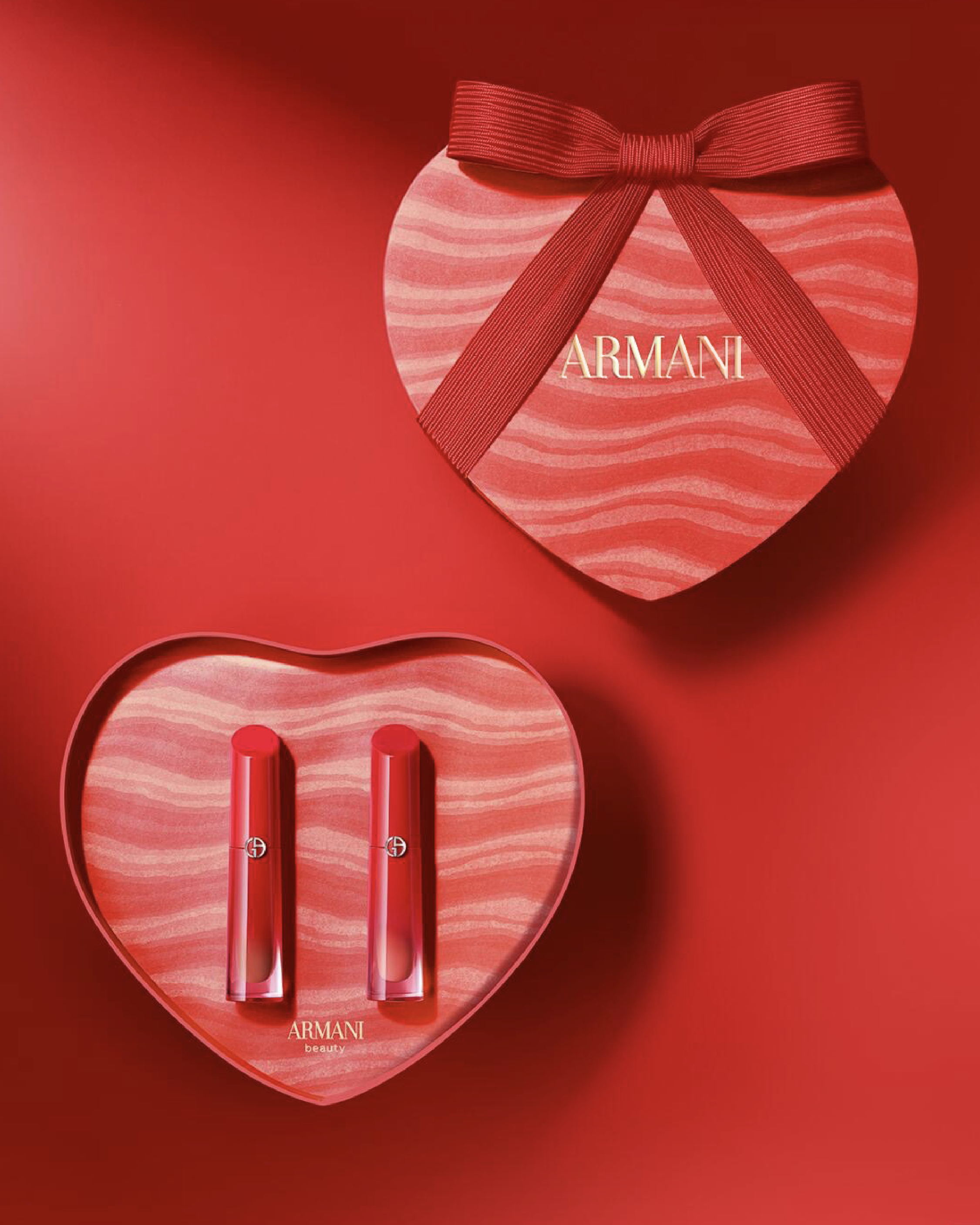
ARMANI VALENTINE’S DAY
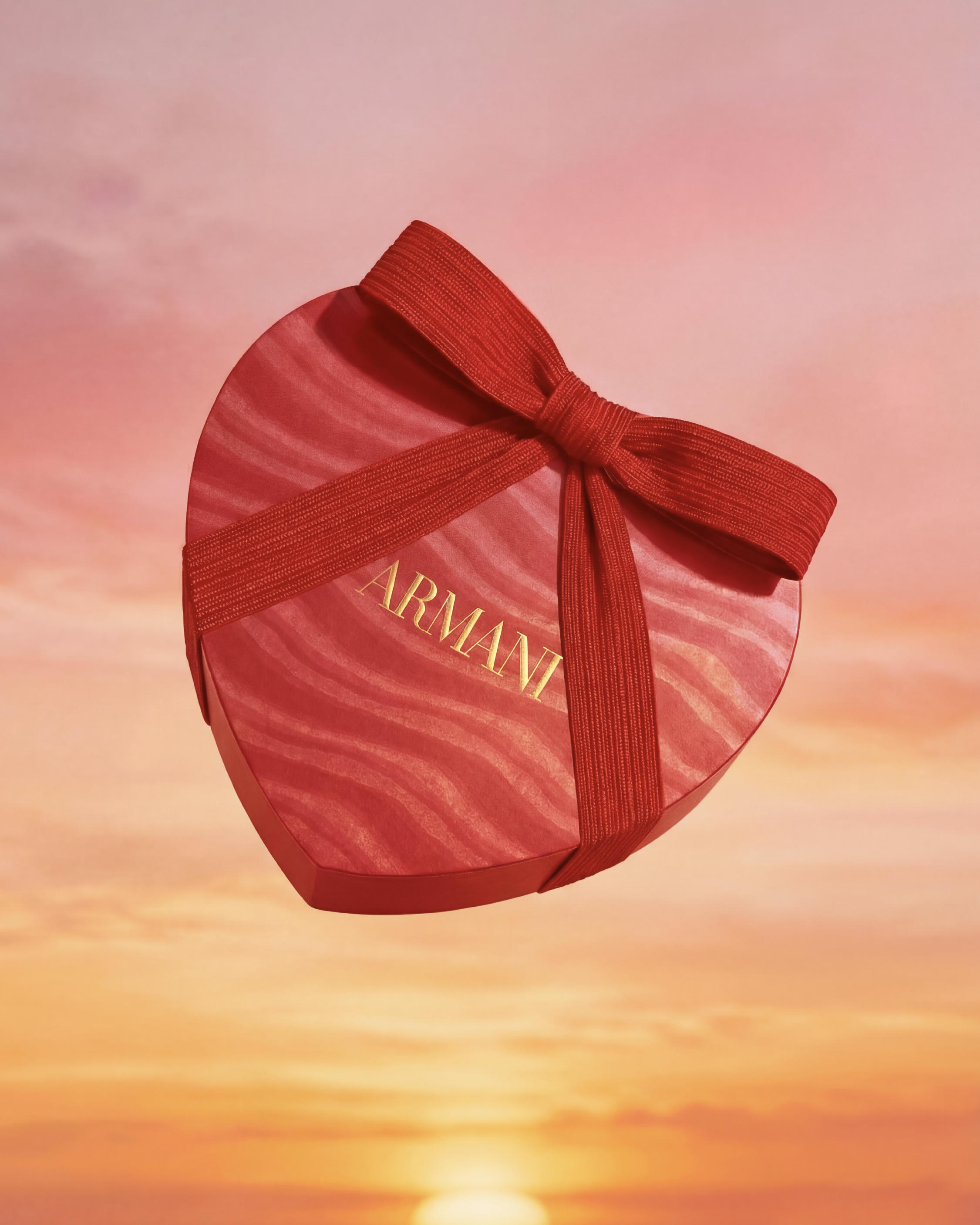
We are proud to unveil our Valentine’s Day 2026 creation in collaboration with Armani.
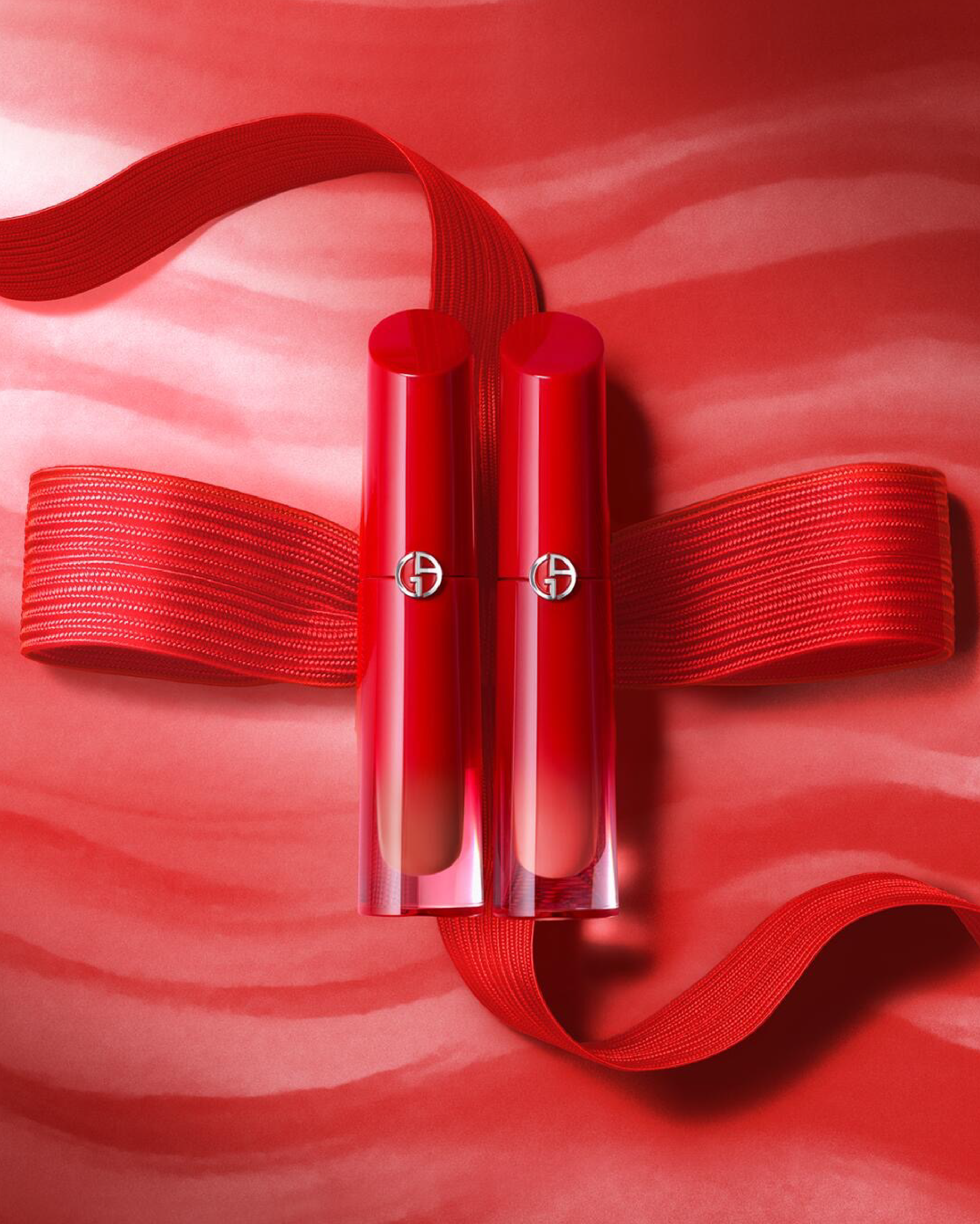
Designed as an exclusive gifting experience, the concept celebrates love through a poetic and immersive visual narrative.
A red thread unfolds across a blushed spring landscape at dawn, guiding two souls where light meets color and emotion gently awakens.
Soft yet vibrant tones, subtle transitions and luminous nuances come together to express the promise of a new beginning, an elegant and contemporary ode to love.
Art Direction – Packaging Design – Art of Gifting
Visuals from @armanibeauty
Dominique Ferrero - Grocery
Dominique Ferrero - Grocery
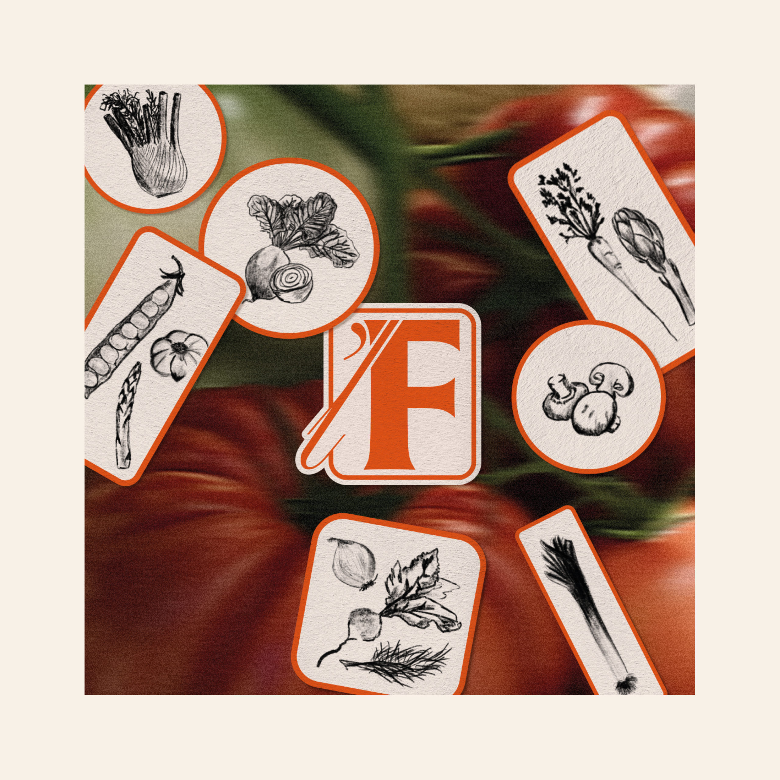
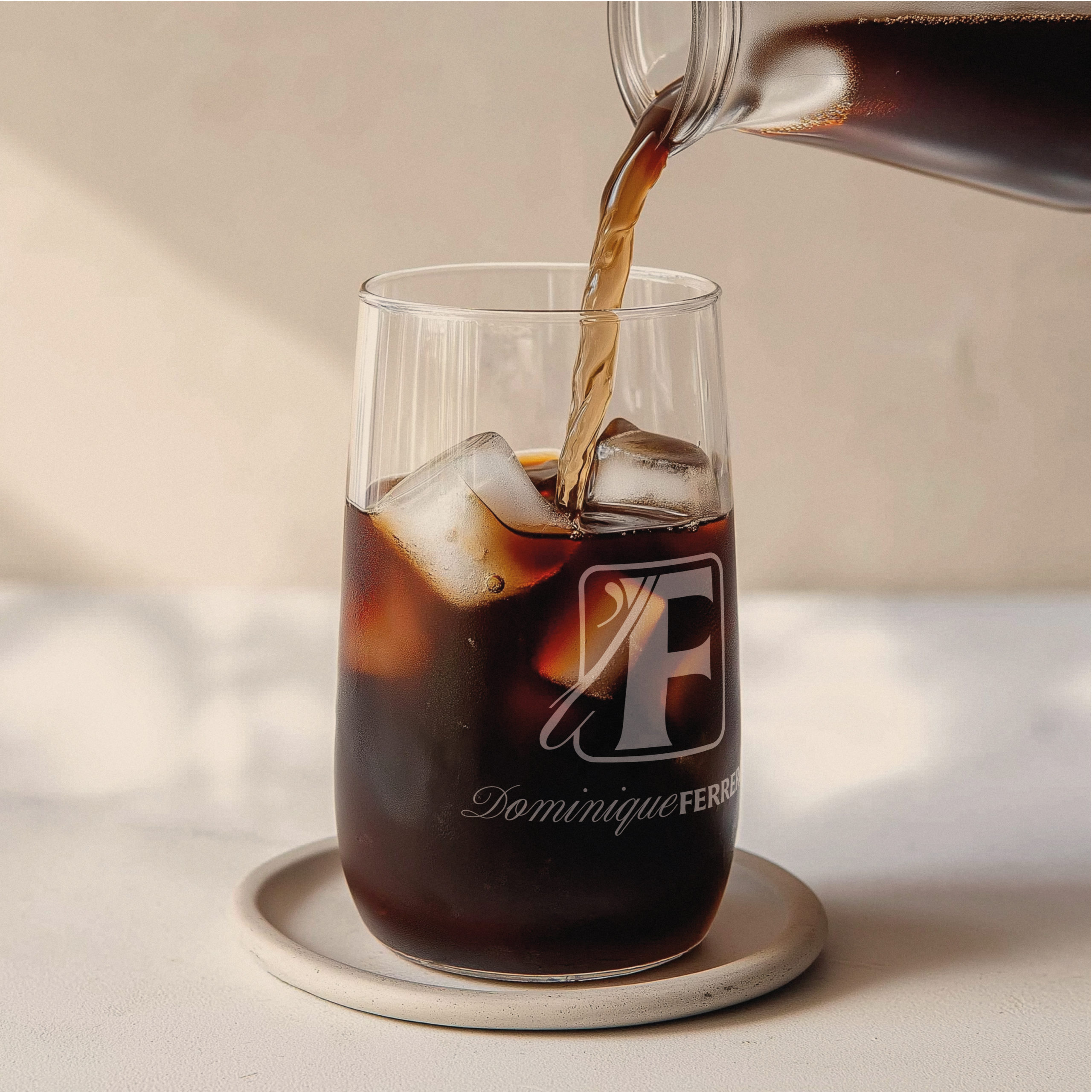
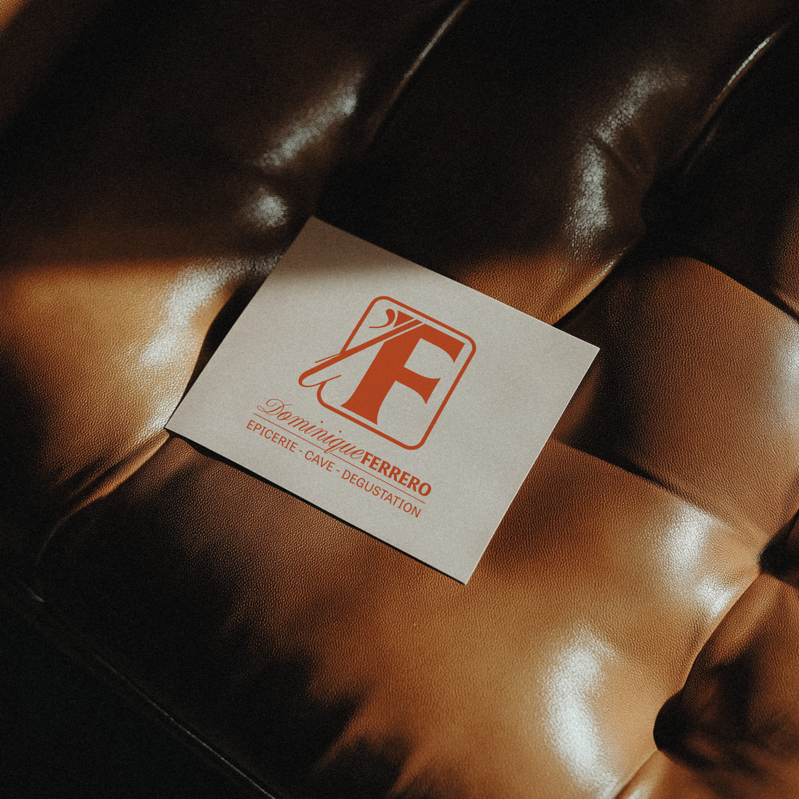
DOMINIQUE FERRERO GROCERY
We had the honor of designing a strong visual identity for « L’F », a renowned épicerie fine in Corsica, created by Dominique Ferrero, known for her exceptional gourmet selections. This unique space stands out for its refined offering going beyond the traditional épicerie framework and its ability to bring together food lovers.
Our approach was simple but ambitious: to create a unique identity that reflects the emblematic spirit of this place while breaking the usual market codes. We were keen to show that « L’F » is more than just a business, it is a friendly place where lasting connections are created between gastronomy enthusiasts and curious gourmands.
Totebag illustration @rose_cesari ☀️
Babybel x Stranger Things
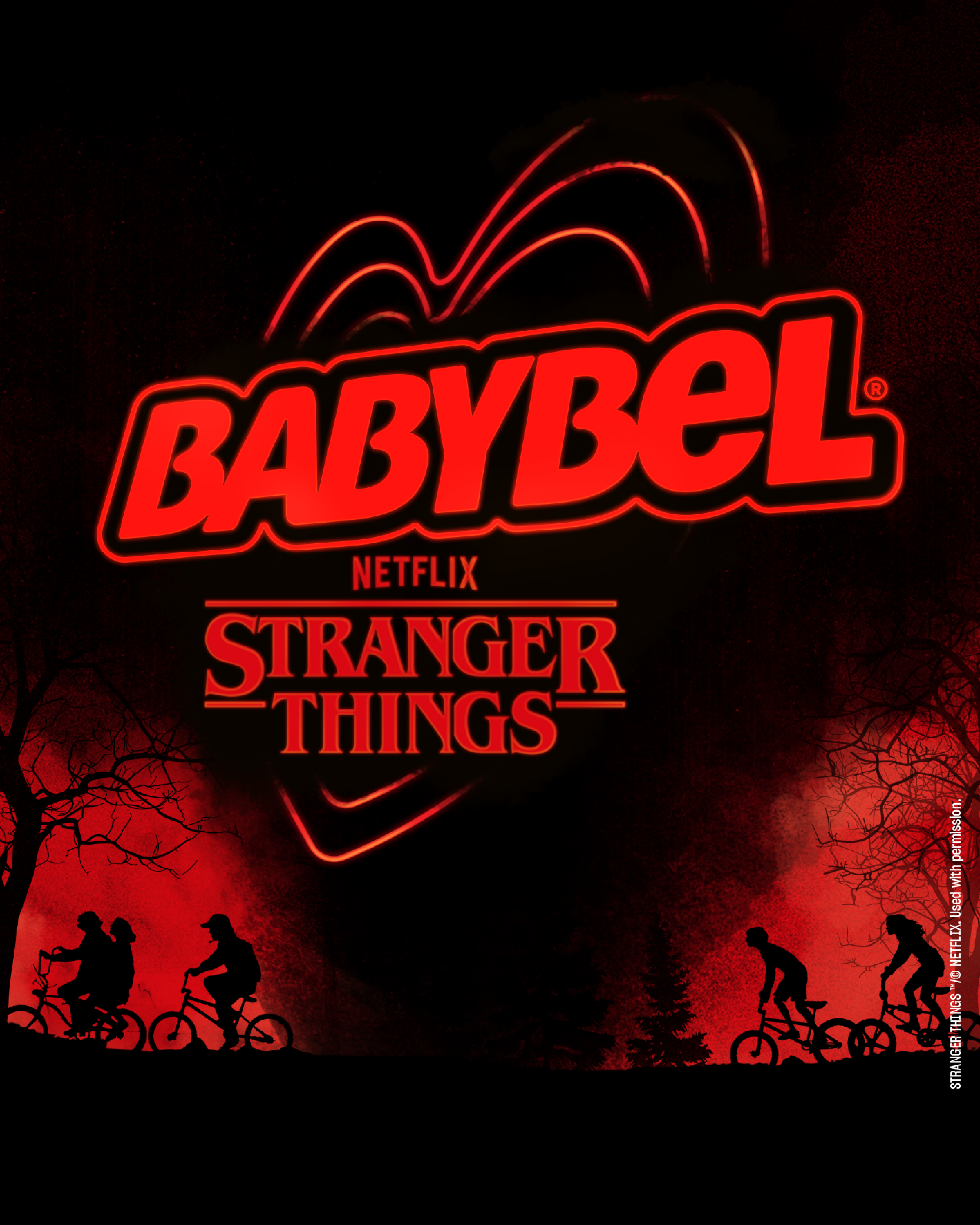
Babybel x Stranger Things
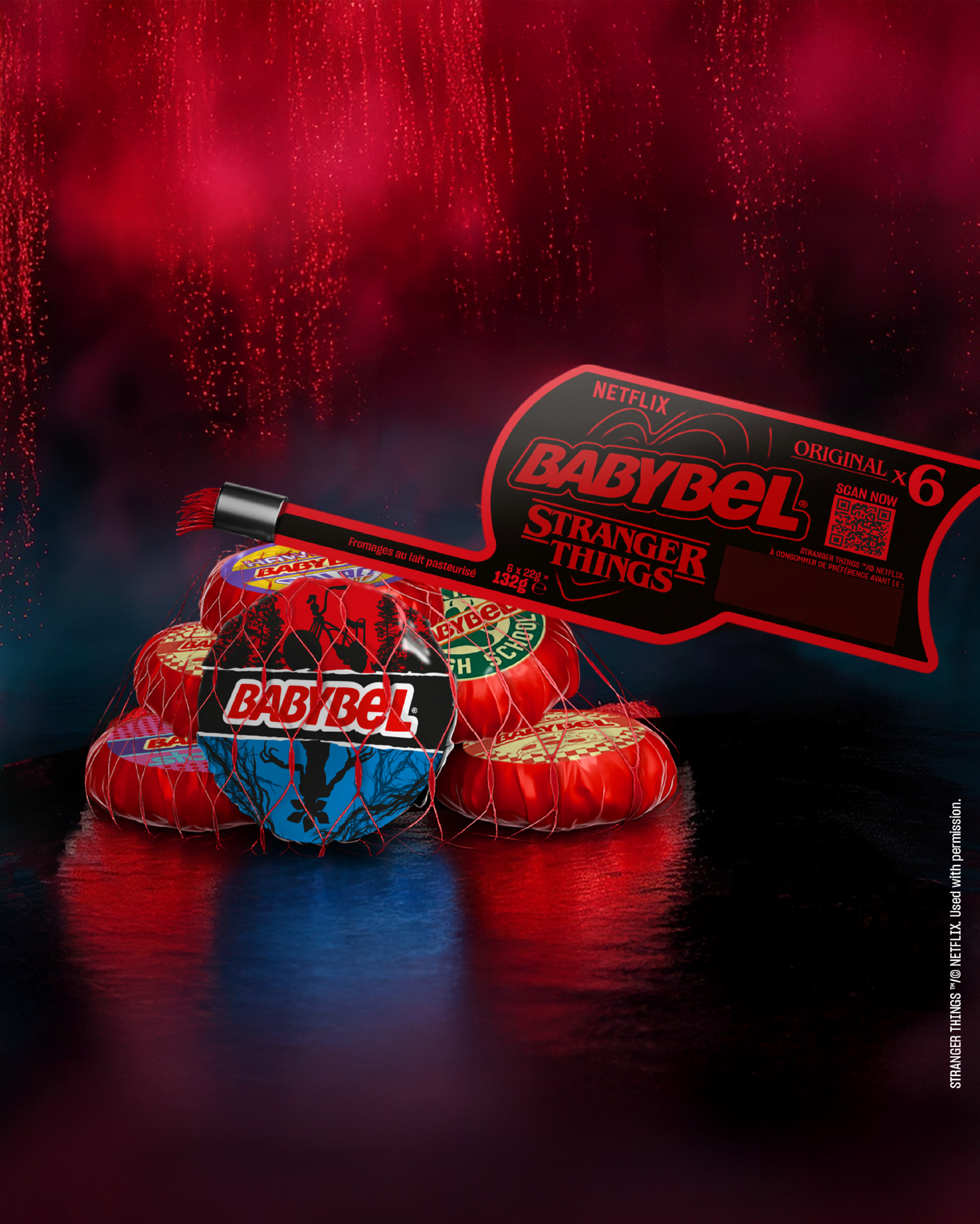
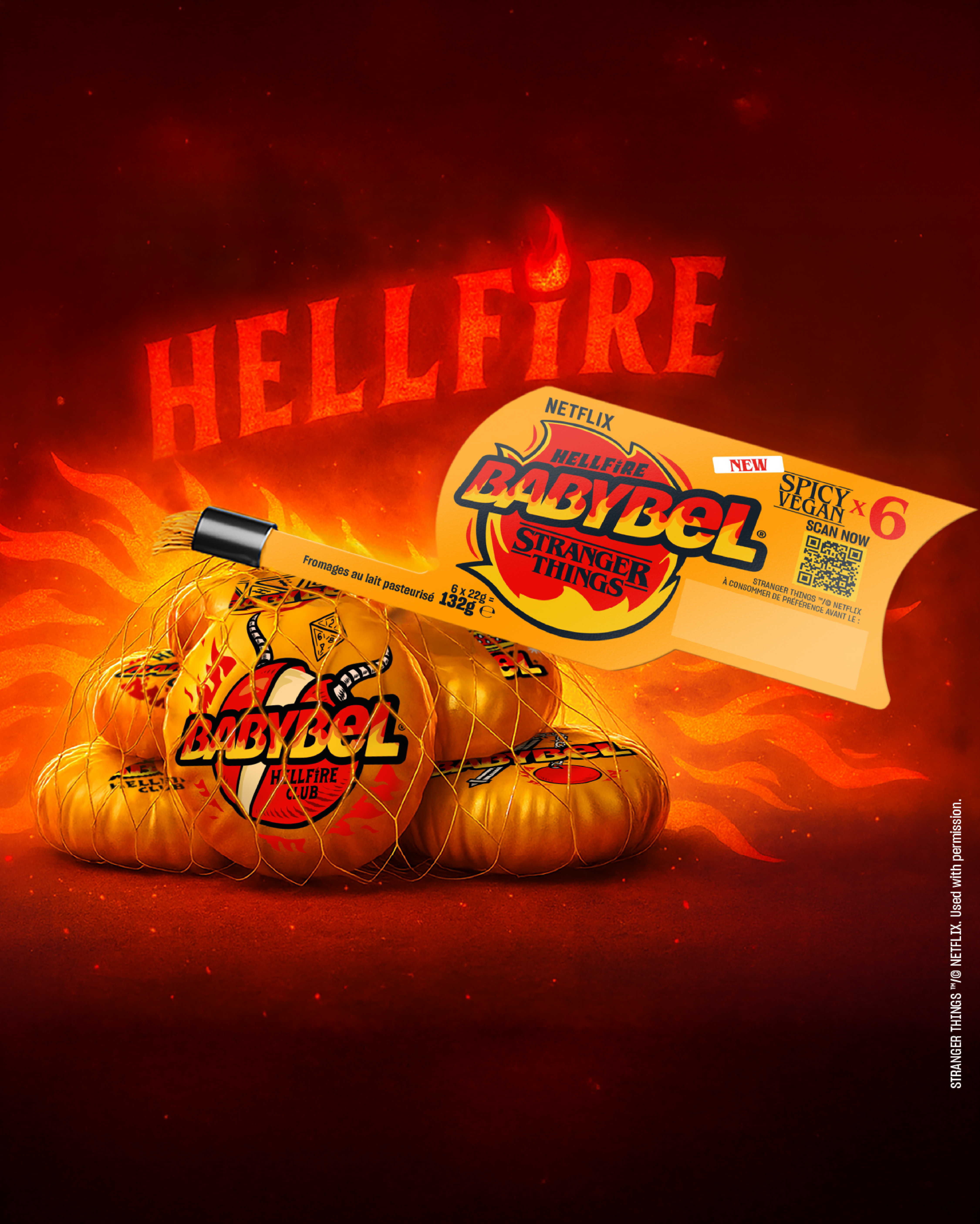
BABYBEL x STRANGER THINGS
Babybel just got Stranger!
The most unexpected — and delicious — collaboration, taking indulgence straight into the Upside Down.
Alongside the brand, 4B delivers a full creative direction: a bold visual universe where the codes of Stranger Things blend with Babybel’s iconic roundness and playful spirit. Each wax shell becomes a micro-story, a direct wink to fans — instantly recognisable and irresistibly collectible. Vintage typography, authentic colour codes and immersive illustrations inspired by Stranger Things.
A collaboration that brings together pop culture and desirability.
[Project developed as part of the 4B alliance – @bronson_group x @agence4uatre]
Visuals — @wearefinesgueules
Boursin x EMIP
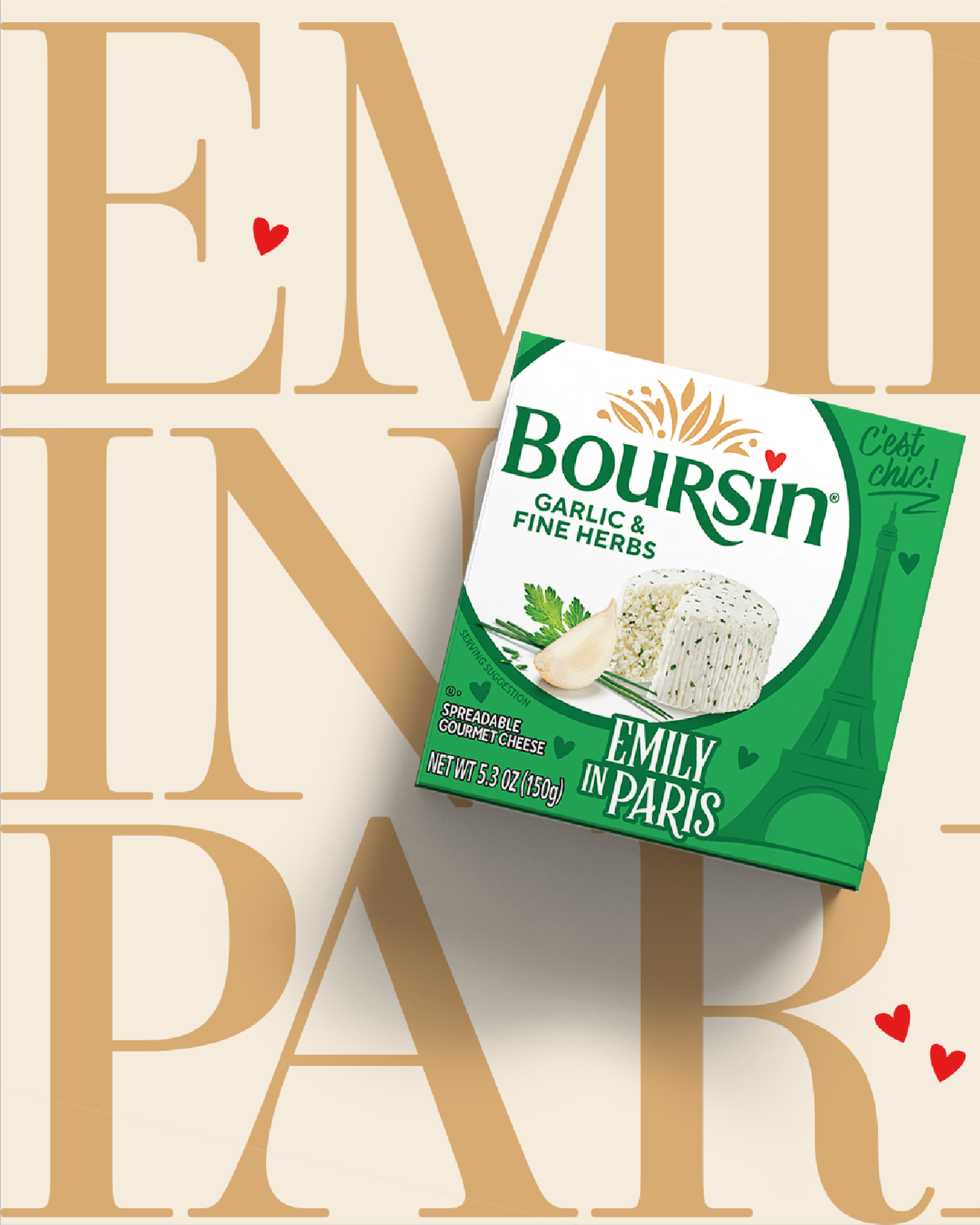
Boursin x EMIP
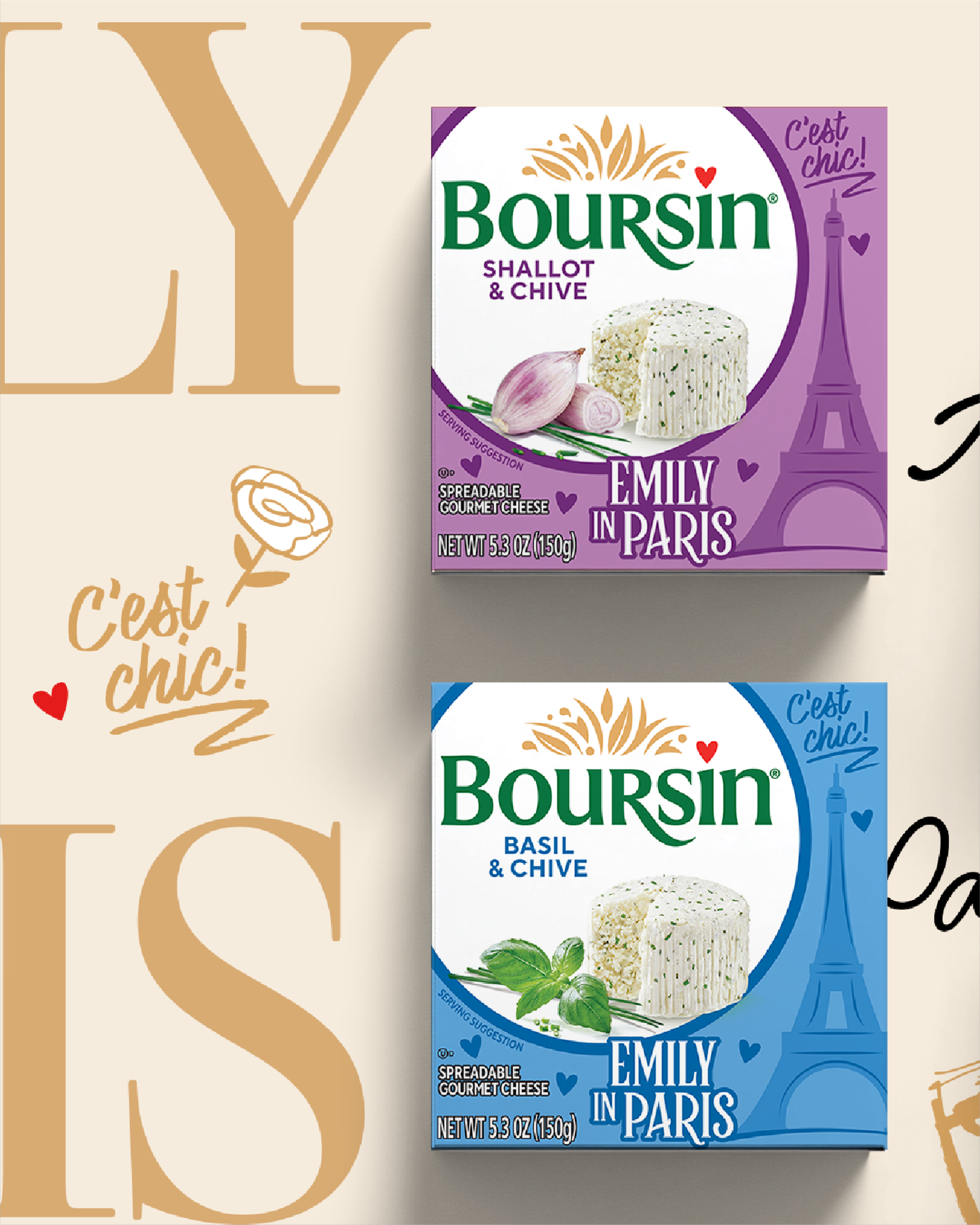
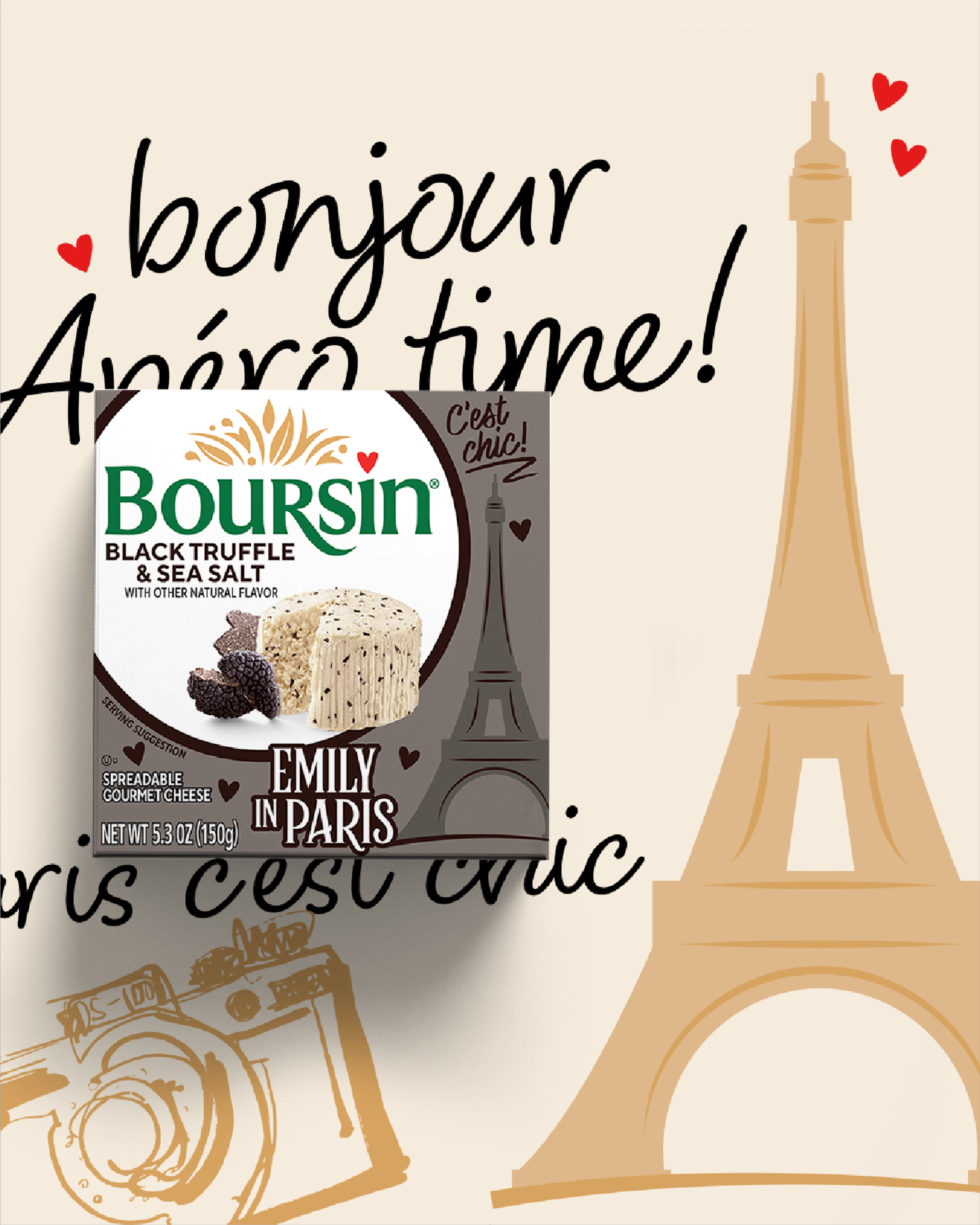
BOURSIN x EMILY IN PARIS
When indulgent pleasure meets Parisian style ✨
To celebrate the latest season of Emily in Paris, Boursin unveils its very first collaboration and reimagines its packaging through the graphic universe of the series.
An off-centred brand block, pop colours, elegant typography, and visual nods to Paris and Emily’s ultra-stylised aesthetic: each pack becomes a true creative playground, designed as much like a lifestyle object as a food product.
A design approach where packaging tells a story — that of an iconic brand opening up to pop culture and turning the chilled aisle into a Parisian showcase.
[Project developed as part of the 4B alliance – @Bronson_Group x @agence4uatre]
Visuals — @wearefinesgueules
Expertises
One agency fits all needs.

COSMETICS & SPIRITS BRANDS
- L’ORÉAL GROUP
- CARREFOUR
- MHD
- VITAFLOR
- & ASIAN BRANDS :
- KAO
- BY HEALTH
- SEPHORA
- KIMBERLY CLARK

ARTWORKS & FLOW MANAGEMENT
- L’ORÉAL PARIS
- MAYBELLINE
- SHU UEMURA

LUXURY BRANDS
- LANCÔME
- ARMANI
- ESTÉE LAUDER
- ACQUA DI PARMA
- TAKAMI
- SHU UEMURA
- CLARINS
- HELENA RUBINSTEIN

FOOD MARKET
- BEL GROUP
- PRIMEX
- CARREFOUR
- EVIAN

BRAND STRETCHING & EXPERIENCE
- CHRISTOFLE
- DURALEX
- LANCÔME
HEALTHCARE
- VICHY LABORATOIRE
- LA ROCHE-POSAY
- LABORATOIRES ASEPTA
- COSPAL

ELEVATED STORIES
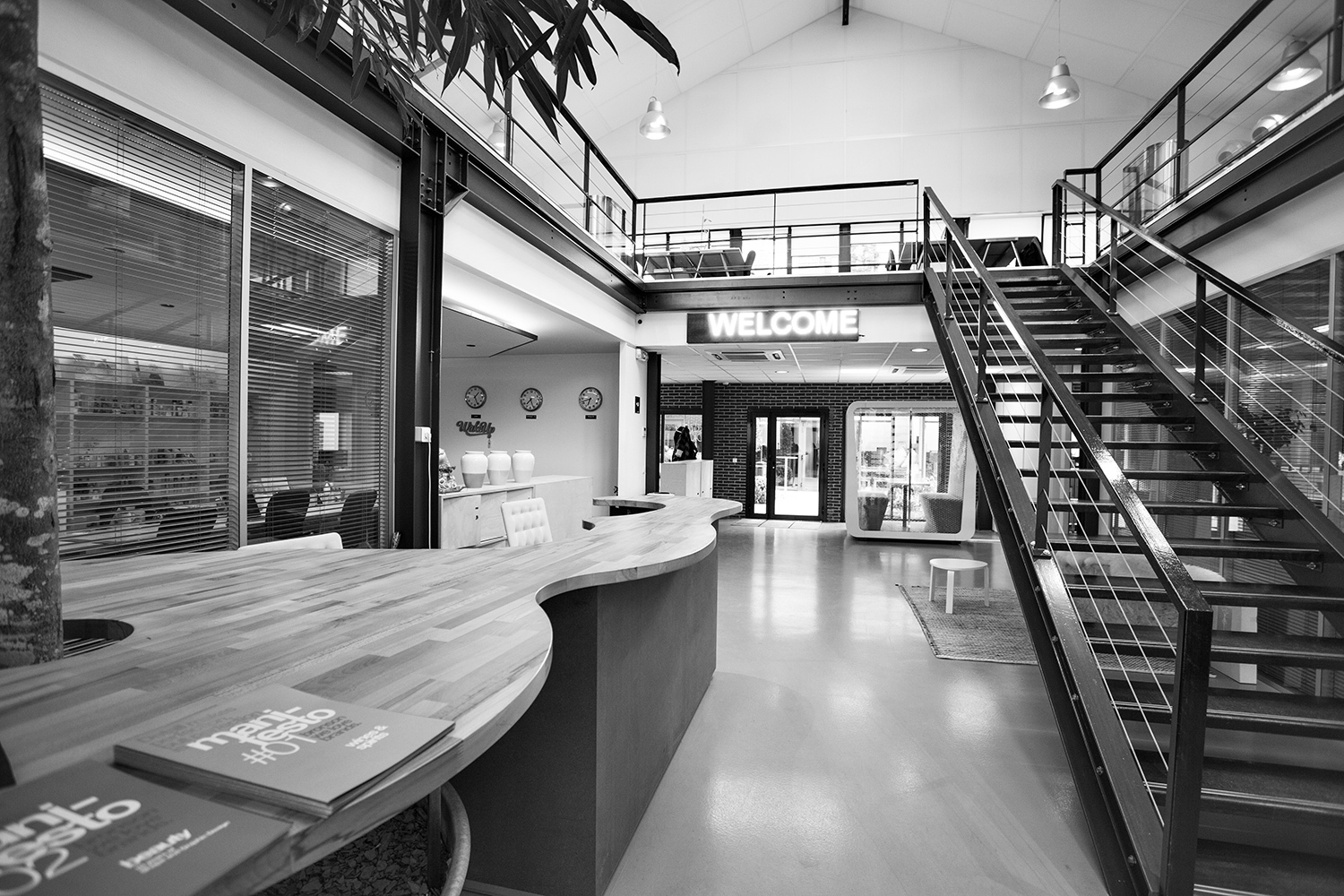
At Bronson, we share the certitude that we work better in a cool place.
That’s why providing a quality working environment to our team stands as a priority.
Through meaningful projects, yearly corporate events and a strong team-spirit, we want to provide the conditions for our coworkers to create and thrive.
In this respect, our culture is based on confidence in our crew, autonomy and we pay a specific attention to integration of new members.
At Bronson, we share the certitude that we work better in a cool place.
That’s why providing a quality working environment to our team stands as a priority.
Through meaningful projects, yearly corporate events and a strong team-spirit, we want to provide the conditions for our coworkers to create and thrive.
In this respect, our culture is based on confidence in our crew, autonomy and we pay a specific attention to integration of new members.
In our super BronsonTeam
Women
Men
Nationalities
Average seniority
Want to join the dream team ? 🚀
Contact UsAgency
BRONSON, a committed agency !
As an independent agency specialized in branding and packaging design, we are committed to working with our clients to bring out the best in their brands.
Creating value is our priority.
Our experts analyse and reveal consumer expectations to build, together, creative and desirable solutions in a responsible way.
Our mission: to create responsible Love Brands!
Because every day counts, our commitment is total.
Contact